What do we mean by the word ‘room’? Last Room begins as an ideas competition which asks designers, artists, architects and writers to imagine a last room – only possibly a room for dying but certainly a room for living. The call: Have you ever visited someone in hospital or a care facility and found the space at odds with what you imagine to be an appropriate dwelling? Have you experienced personally or with others limited mobility, ability, or cognitive loss? Using your experience of aging, limits of physical or cognitive ability, combined with your own experience of lived spaces to imagine a room for yourself—a ‘room’ distilled to the essentials, a room providing for a rich and specific existence. Is this room a real or virtual space, a space of the imagination or a material construction? Is this a static or changeable space?
Is this practical design for use or a conjectural/philosophical inquiry? Is this a call for practical alternatives to institutional architectures geared to efficient and cost-effective care? Or is it a call for a philosophical meditation on how we (consciously and unconsciously) ‘build’ the room as the world around us, where the last room is analogous to the first room we invent to contain the infinite universe outside our body—the first inside that is outside? What is a room in relation to memory and consciousness? Can we dispense with the idea of ‘room’? Can we alter it? All of these are open questions to which responses to this proposal might respond.
Submission Deadline: CLOSED
—
SUBMISSION SPECIFICATIONS
1) design proposals One or two A1 panels (horizontal), with text, renderings and drawings or images appropriate to the proposal. A two min video is optional (max size 5GB). Panel text is limited to 700 words. Panels should be formatted as PDF’s with images in a resolution of 150dpi, RGB colour space, and compressed to a maximum file size of 5mb. Panels should only be identified with the entry number provided during the submission process (in the lower right-hand corner). Entries should be submitted by dropbox or other service and an email with name, contact details and submission number should be sent to ‘submissions@menlopark.ca’ to which we will reply as confirmation of receipt.
2) written meditation (essay) As an alternative to a visual presentation of a design proposal a 2000 word text on the competition theme in relation to the process of design may be submitted. Essays should only be identified with the entry number provided during the submission process.
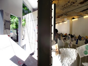
 The Social Studio is a fashion label, café and social enterprise in Melbourne, Australia. Design is a vehicle to generate education and employment opportunities for young people with talent from refugee backgrounds. A retail shop sells beautifully crafted products made in-house and promotes sustainable and ethical fashion. Events and workshops create connections between people from diverse cultures and the Studio’s café provides a platform to share knowledge, skills and stories.

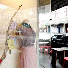


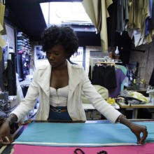


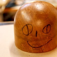

photographer: Eugenia Lim
The basis for this essay was a response to a call for papers on the topic Design as a Critical (Non-productive) Practice. The call draws attention to the status of the relationship of art and design, described as a dysfunctional binary relationship of ‘pure’ and ‘applied’ art. Art and design seemingly move in opposing directions: “Contemporary art asks any question, down to the very grounds of thinking and doing. Design ‘builds’ to fulfill any brief or program…Design doesn’t do failure and art deliberately problematizes notions of ‘usability’.” [1] The intent is to raise the question of what ‘criticality’ means in the context of design practice.
My response to the issue is complicated because I am not entirely sure that we commonly understand what ‘criticality’ means in art practice and therefore I am not convinced that art and design exist in the kind of relationship as described. In my view the practice of art ought to be distinguished from works of art. While there appears to be general consensus about what criticality means for works of art, there is little discussion about what criticality means for art practice. In the first part of this essay I will show that our commonly held view of what criticality means for art works does not at all emerge from the practice of art but derives in large part from aesthetic theory. In the second part I will pose the question of what a theory of art practice could possibly be.
The call for papers generally concerns the teaching of art and design, that is, the passing down of knowledge from one generation to another. I belong to a generation that was privileged to experience the transformation of the dominant model within the arts and sciences as it manifested within the fine art disciplines. Following Frederic Jameson [2], let us recall the passing from the model of the organism to that of language. The Bauhaus movement of the 20s and 30s, which gave us the concept of ‘visual art’, developed its programs of art and design based on the model of the organism and the then current scientific research based in it: gestalt theory. Modernist aesthetic theory from Pater to Greenberg would be unthinkable without the focus on perception that was governed by the metaphor of the organism. Both the model and the science that operated at the time had great influence on the teaching of art right through the sixties, culminating in the phenomenological defence of minimalist art in the US.
However, by the end of the sixties the new model of language was in ascendancy as well as structuralism, the scientific theory that accompanied it. Within the university arts and sciences, the social sciences began to occupy the pride of place over the empirical sciences. Within philosophical circles, metaphysics now appeared more subversive than epistemology. Within society as a whole, the mass media now appeared to exemplify the character of technological societies. The major shift in focus, from perception to communication, was traumatic for art schools and university art departments. One aspect of the trauma for teaching easily recalled is the sudden relevance of photographic reproduction and the abrupt loss of interest in painting; but this was no more traumatic than the new interest in literary theory and the dumping of the psychology of perception.
The above anecdotal recollection of the transformation of the dominant model is intended to underline that what counts as ‘critical’ is visible because of the dominant model. Frankfurt School critical theory and cultural studies appear ‘critical’ because they make sense within the dominant metaphor. But the previous dominant metaphor produced its own version of criticality. Thus while at the turn of the 20th century Picasso and Braque could be styled as empirical researchers of visual perception, today’s artists are more likely seen as social researchers of an image economy.
One thing that has not changed with the transformation of the dominant model and the subsequent transformation of the teaching of art is the role of aesthetic theory in the academy. Since the early days of the French Academy, aesthetic theory has been used as a rhetoric. It was used to legitimate the practice of fine art in aristocratic society and to distinguish it from the practice of craft. Simply put, aesthetic theory argues that the practice of art primarily concerns strategic knowledge, not tactical skill. The same holds true today. Knowledge of aesthetic theory implicitly underpins art and design programs in degree-granting institutions. Aesthetic theory defends art practice and legitimates it. At the same time, aesthetic theory does not know what art practice is. The object of any aesthetic theory is always the art work, always the object that is received (by an audience, by a public). While there are always discussions and mentions of practices, there is very little attempt to theorize such practices. It is as if theories of art are being offered to student artists as theories of practice. But this would be like offering courses in the theories of yoga without ever thematically theorizing the practice of yoga. The theories of yoga are only of slight interest without corresponding theories of the way yoga can be practiced. The only knowledge we have of artistic practices, apart from works, are collections of artist writings and interviews with artists. However, artist writings and interviews rarely thematize or theorize practice and more often than not focus on the artist’s production or on aesthetic theory.
As universities and other degree-granting organizations develop new business models to grow as institutions, they develop new lines of rhetoric to attract funding. The model of research-creation is simply this. While the model does work to support some art practices and help articulate new forms of relationships in practice, the aim is to create new ‘applications’ for art, usually user-friendly front-ends for what would be otherwise obscure practices in science and technology. The research model does nothing to support the connection between generations of artists. There is no business benefit for universities in theorizing the practices of art precisely because they now look to the market place for ‘solutions’ rather than to the future of art practices.
I am not convinced that this situation differs much between the teaching of art and the teaching of design. The aesthetic theory that is taught may be different but it should be kept in mind that the function of aesthetic theory in art practice is primarily rhetorical and intended for a specific public or audience. The public for art is comprised of professionals whereas the audience for design is created by business interests.
It is presumed that previous generations of artists were able to pass down practical knowledge by mentorship and other less formal means. The present situation that has been coming since the previous mid-century is an age of mass education and the education of relatively massive numbers of artists. Yet because there are huge numbers of artists, we cannot take the transmission of practical knowledge for granted. For this we need now to focus on theories of practices to meet the needs of large numbers of artists to help them sustain their artistic concerns, especially when the current business climate does not support them. The organization of artist communities around political identities and short-term political goals has been and continues to be useful but there are other art practices that will not be supported in this way.
What I mean by the practice of art is the practical knowledge of art, what Aristotle distinguished from sophia as phronesis. Aristotle says that phronesis “is not simply a skill…as it involves not only the ability to decide how to achieve a certain end, but also the ability to reflect upon and determine good ends consistent with the aim of living well overall.” [3] The trouble is that practical knowledge in art practice has been generally bound up and confused with making things (techne), i.e. the production of art works.
The question arises that even if there is such a thing as practical knowledge in art, why should we care about it? What we look to the artist for is works of some kind (obviously I am including immaterial works, performances, etc.). Artists may have certain ways of doing things but why should we care since what affects us is the works they produce? The question conceals the assumption that there is nothing inherently critical in the practice of art. The ideas of criticality that we have and that we talk about are generated solely on the basis of aesthetic theory and not on the basis of experience with the particulars of practices.
What kind of statements reflect on practice? Here is one often quoted statement attributed to Picasso: I do not seek, I find. [4] Picasso is of course the most prolific of modern artists and yet he characterizes his practice in terms of finding, not making. Here is another statement, this by Marcel Duchamp: I like living, breathing better than working. [5] Although it is well known that some of Duchamp’s works are meticulously crafted, his statement suggests that he would prefer not making anything at all. His selection of things and naming them ‘Readymade’ implicitly argues against understanding his gesture as a kind of making.
Of course the statements by Picasso and Duchamp were not offered as theoretical statements on practice, even if they are. The statements were made in the context of conversations with perceptive and analytical critics who selected and publicized them. Closer to our time are statements coming out of the conceptual art movement. The difference between art theory and a theory of practice could not be better illustrated than by a comparison of contributions by Joseph Kosuth and Lawrence Weiner to the anthology of artist writings put together by H. von Gerd de Vries in 1974. Kosuth contributed ‘Art After Philosophy’. [6] Weiner contributed his then untitled statement:
1. The artist may construct the piece.
2. The work may be fabricated.
3. The work need not be built.
Each being equal and consistent with the intent of the artist. The decision
as to condition rests with the receiver upon the occasion of receivership. [7]
Kosuth’s writing focuses on art as it is received: “works of art are analytic propositions”. Even though he is offering a polemic against aesthetics, he is essentially still writing a theory of art works. Weiner is not doing that. His statement is not about works as they are received but about the approach to aesthetic experience that may or may not lead to the production of a work. This is consistent with the statements of Picasso and Duchamp quoted above. Practice is only an openness to the realization of an aesthetic experience in a work, which may, from the artist’s perspective, be realized without it. Though it sounds paradoxical, practice is not the same thing as making and practice does not necessarily lead to making. Most revealing of our current situation is the institution of the ‘artist talk’. The artist talk is so named because we look to the artist to speak candidly about their practice. We already have the works but we look to the artist to get their take on what they do. However, in reality, the artist talk is almost inevitably a mishmash of production talk, art history and art theory accompanied by studio anecdotes. There can be no conversation with an artist about practice because practice has not been observed thematically and as a subject of deliberation. If the particulars of practice are ever addressed by an audience, the question rarely reaches beyond “how did you do that?, strictly a question about production and having nothing to do with the task of ‘living well’.
I am not suggesting that the task of observing one’s own practice and theorizing it at least to the extent of organizing talking points concerning it is easy to do. It is unlikely that such theorizations can be as attractive as the compact and often incisive theories of art works that we have had the pleasure to come across. However humble such activity is, it has the advantage of coming from actual experience and by its nature will lead to conversations rather than demonstrations of competencies.
How can theorizing one’s practice bear on the task of critical thinking? We have artists who are now graduating from doctoral programs. We know that many of these artists are extremely competent. They know their aesthetic theory. They know their art history. Many of them know complex technological processes. And many of them already produce engaged and occasionally exciting works. What more can one want from an educational program? Is there any serious problem here? The answer is yes, there is a serious problem. Despite these many competencies, which are undoubtably important and critical, there is no concern for how experience is passed from one generation to another. Experience in practice reflects the lives of people as artists and bears on the life and death of individuals and generations. That is critical. Practical knowledge of art is at once the most transitory and yet the most durable kind of knowledge. It is bound to outlast even this, what Jameson, quoting Nietzsche, referred to as the ‘prison house of language’.
1. Excerpt from the call for papers, Design as a Critical (Non-productive) Practice (session chair: Andrew Forster); University Arts Association of Canada Conference, Montreal, October, 2012.
2. See Jameson, Fredric. “Preface.” The Prison-House of Language: A Critical Account of Structuralism and Russian Formalism. 1 ed. Princeton University Press, 1975. v-xi.
3. “Phronesis.” Wikipedia: The Free Encyclopedia. Wikimedia Foundation, Inc. 25 March 2013. Web. 13 April 2013. See also Gadamer, Hans Georg. “What is Practice? The Conditions of Social Reason.” Trans. Frederick G. Lawrence. Reason in the Age of Science. Cambridge (Mass.): MIT Press, 1981. 69-87.
4. Quoted in Graham Sutherland, “A Trend in English Draughtsmanship”, Signature, III (1936), pp. 7-13. Sourced by Wikiquotes.
5. Cabanne, Pierre. Dialogues With Marcel Duchamp. Viking Press, 1971. 72.
6. Kosuth, Joseph. “Art After Philosophy.” Über Kunst; Künstlertexte Zum Veränderten Kunstverständnis Nach 1965. On Art; Artist’s Writing on the Changed Notion of Art After 1965. Ed. Gerd de Vries. [Köln]: M. DuMont Schauberg, 1974. 136-75.
7. Weiner, Lawrence. “Untitled.” Über Kunst; Künstlertexte Zum Veränderten Kunstverständnis Nach 1965. On Art; Artist’s Writing on the Changed Notion of Art After 1965. Ed. Gerd de Vries. [Köln]: M. DuMont Schauberg, 1974. 248-49.
]]>
While commercial appropriations are taken for granted in fashion and design, the field of visual art has always maintained at least a pretext of critical distance, if only in the guise of artistic freedom. Critical distance, in a contemporary context, is a matter of thinking critically about the convoluted culture that both artists and designers are currently implicated in, of harnessing the conceptual possibilities of creative practice without directing it toward a commercial outcome.
Takashi Murakami’s artwork throws open this critical door and launches straight into the heart of commerce. His work is cute, seductive, exceptionally marketable and consumable, wide-ranging and successful both critically and commercially. He has become a formidable capitalist and a formidable influence in the art world, most particularly in the context of contemporary Japanese art. How can such an overt surrender to the systems of capital have been so well embraced by the art world, and what are the effects on critical artistic practice?
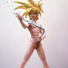
Among Murakami’s most celebrated works is the sculpture My Lonesome Cowboy (1998), a life-size depiction of a naked boy, proudly spouting a stream of white semen that circles around him in the style of a lasso. The work is an appropriation from the popular genre of erotic manga, otaku, transformed into an art object through the title’s reference to Andy Warhol’s 1968 film Lonesome Cowboys. With bright plastic blue hair and cartoon features, it is cute and colourful enough to appeal to a general audience at the same time as carrying off a semblance of social critique through its exaggerated sexuality and references to 1960s Pop art. Yet to what extent does My Lonesome Cowboy simply reproduce a popular fetish, thereby reinforcing the socio-economic conditioning of consumer desire, as opposed to providing insight or critique?
The design of the figure was modeled after a similar character in otaku animation, and in order to be as faithful to the genre as possible, Murakami employed commercial manufacturers to produce the piece. There is no sign that Murakami was attempting to challenge or modify the otaku stereotype, with its abstraction of human desire and affirmation of sexual fantasy according to social constructs. The trail of semen that encircles My Lonesome Cowboy is the most obvious example of this fetishism – the human bodily fluid is stylised and converted into a static, plastic model of imaginary dimensions. Human experience is thus transformed into an object that emits other-worldly qualities, with a dollar price to match. It becomes a commodity that fuels the drive to consume unnecessary goods. In Marx’s terms, we are talking about commodity fetishism. The commodity is not produced to satisfy primal needs or desires, but to enhance an unnecessary cycle of production and consumption, abstracted from human necessity. The single feature of the work that might remind us of human desire and bodily experience is brandished, cowboy-style, as a plastic weapon.
[click any image for caption and gallery]
Murukami’s celebration of the reified commodity is even more evident in the design for Hiropon (1997), the female counterpart to My Lonesome Cowboy. Hiropon’s adolescent body is precariously balanced on one pointed foot, her tiny frame completely dwarfed by two bulbous breasts that explode from a tiny bikini. Only her elaborate blue hair competes with the presence of the breasts, from which milk spouts. The milk forms a complete circle around her, doubling as a skipping rope. Like My Lonesome Cowboy, Hiropon was not created as a critique of the way women are represented in otaku culture. Instead, it directly appeals to the market. Murakami admits, “Because making a life-size figure is really no different than making a sex doll (a dutch wife) in the context of the anime figure, it’s safe to say it ours was a fairly shameless plan from the start.” [1]
This desire to conform to, rather than challenge, the otaku market was made even more transparent when Murakami decided to remodel Hiropon as a new character, Miss Ko2, to be more in line with the sexual fetishism of the popular genre. Indeed, when Murakami approached a leading contemporary otaku designer about using one of his computer-game characters as the model for Miss Ko2, Murakami received a skeptical response. The designer, who is known simply as ‘Bome,’ replied, “This game is an utterly artless pandering to stereotypical otaku fetishism. Nor is it original – rather it was created with a complete understanding of the tastes of the entire otaku market for uniform fetishism.” To which Murakami said, “That’s what I want.” [2] The problems associated with this critical ambivalence become more apparent in the context of Murakami’s subsequent forays into overt commercial production.
Murakami’s status in the contemporary art market escalated in 2003 when he collaborated with Marc Jacobs on a range of designer handbags for elite fashion brand Luis Vuitton. Working with his own iconography, he created two monograms – one based on round, colourful flowers animated with smiling faces, the other featuring floating eye motifs taken from his anime characters. While clearly maintaining links to his visual art practice and its pretext of criticality, all traces of content, including the subtext of cultural critique, was evacuated from the resulting design. The thoroughly friendly pattern served simply to highlight and ornament the traditional Luis Vuitton monogram, ‘LV’, which remained within the pattern, transformed from brown and gold into Murakami’s more colourful primary palette. Of course, there is nothing illogical about this kind of decorative design emerging in the context of fashion. When simultaneously embraced by the art world, however, the issue of the artwork’s ‘design’ becomes more complex. In this case, Murakami’s aesthetic was a vehicle for commercial advertising both inside and outside of the gallery. The effect was obvious and at the same time insidious. Some critics compare his work to Warhol, implying a critical tension between the idea of high art and popular culture.
Murakami’s work differs from Warhol in an important aspect; it lacks critical tension. Art retains no space from consumerism to provide contrast or juxtaposition. Where Warhol filled the gallery with replicas of existing consumer imagery, in the form of Brillo boxes for example, Murakami paints without referent his own branding. Murakami is the Brillo manufacturer. His trademark character, ‘DOB’ is one such product. A large, round, panda face with big friendly eyes rests on a petite mouse-like body, resulting in a cute combination of Astro-boy, and – in true Warholian style – Mickey Mouse. Where Warhol displayed the existing consumer fetishism of Mickey Mouse in his reproductions, Murakami prints his own logo, exploiting the fetishistic character of consumer imagery to create his own commodity. DOB can be found on keychains, on clothing, on postcards, in department stores and also, naturally, in most art museum stores. Murakami employs commercial manufacturers to create seamless objects that blend perfectly into the commercial landscape.
As Naomi Klein so clearly describes in the introductory paragraph to No Logo, consumer culture does not create products anymore: “successful corporations must produce brands, as opposed to products.” In the realms of both art and commerce, Murakami’s DOB functions as commercial branding, and in both realms this facade celebrates the depthless nature of consumerism. There is not much room for consumer agency or alternative modes of production and consumption in Murakami’s model – he appropriates the signs and symbols of popular culture, reiterates them in an art context, and then is re-appropriated in return. If the product of consumer capitalism is now obsolete, as Klein suggests, and what is advertised, sold and distributed in the marketplace is now branding itself, then Murakami is indeed the perfect corporation. Murakami’s logo spreads across museums, commercial galleries, fashion advertising and into the street.
The significance of Murakami’s brand became evident when he recently battled a rival manufacturer, Narumiya International, for infringing copyright. Claiming that the children’s clothing brand had used anime characters with similar mouse-like characteristics to his cherished DOB, Murakami reverted to an assertion of the value of his work as ‘art.’ After the case was settled, he released a statement claiming, ‘[t]he concept of originality is the lifeline of contemporary art… The characters that I create are not just characters; they are also art.” Rather than exploring the interplay of his appropriations with consumer culture, Murakami instead defended his commercial territory, at the same time as adopting the category of ‘high art’, claiming tens of millions of yen in compensation.
Murakami adopts categories of ‘design,’ and ‘art,’ opportunistically – reinforcing the value of both in order to capitalise on them, and blurring boundaries when it suits. This practice of high art/ low art / high design/ low design is a perfect statement of the postmodern paradox, where disciplinary boundaries are uncertain and no ‘outside’ position seems to be available. It is important to question the popular and critical embrace of this apparent surrender to consumerism, and to think carefully about what the lack of critique – both in the production and reception of his work – signifies for the art world more broadly.
Murakami’s work is described in terms of a breakdown of meaning – the title of his major solo exhibition in 1999 was Takashi Murakami: the meaning of the nonsense of the meaning. This breakdown, however, does not challenge or penetrate the surface of consumer branding, advertising or merchandising. It does, however, disrupt the very ‘meaning’ of art within a context of rampant consumerism. Murakami thus embodies a critical impasse in contemporary art. Sampling and mixing the signs and systems of both modern and postmodern culture, his work faces the fundamental paradox of postmodernism itself – that the breakdown of structural meaning is used to provide an illusion of meaning for the systems of late capitalism. In the process of eradicating distinctions between art and commerce, this kind of practice eradicates space for a critical voice, and threatens the basis of artistic freedom.
]]>1. Takashi Murakami, ‘Life as a creator’ in Summon monsters? Open the door? Heal? Or die?, eds. Kaikai Kiki Co. & MCA, (Saitama-Ken: Kaikai Kiki Co, 2002). 138
2. Murakami. 140
Morality and the pursuit of authenticity have been of perennial concern to the practice of form-giving — specifically design. To design is to mark out; it involves separating out what is from what should be. Inherent in this process is the establishment of a need. Victor Papanek, for example, posits that “design is the conscious effort to impose meaningful order.”[1] Whether this is the ordering of shapes and lines on a sheet of paper or the gathering of materials to create a tool, the designer engages in a quasi-rational process of selecting a goal and a means of achieving that goal. In this light, design implies a progressive movement toward what should be.
This understanding of design corresponds with the common definition of critique as discernment or the evaluation of what is and what is not. Implied in the logic of critique is the finding and presentation of truth. Critical Theory from the Frankfurt School tradition has been described as an endeavour “to liberate human beings from the circumstances that enslave them.”[2] It is predicated on a notion that the world is in ruins, that humans are in chains, and that there are universal concepts of human dignity and welfare. Change is made through rigorous critique of these conditions.
If design and critique share a similar process by which what is is separated from what is not or what should be they may also share similar fates. More recent work in the area of critical design has shifted from a focus on negation to a focus on the aesthetics of relation and participation. Bruno Latour’s work in actor-network theory and Jacques Ranciere’s concept of the distribution of the sensible can aid in understanding this shift: Latour’s focus on socio-technical configurations (which involve science and technologies through history, philosophy and sociology) is useful because of design’s involvement with communication, information and technical innovation. Ranciere’s analysis of the image and its use in progressive politics is useful because of the importance of visuality and experience in design. Interestingly, both Latour and Ranciere assess the limits of criticality. The question follows: how can these limits be applied to criticality in design?
[click any image for caption and gallery]
Within design, the critical stance has been expressed in at least two different ways. The first way is closely aligned with the tenets of Critical Theory. Emancipation through a critique of mass media is seen as the primary strategy. It tends to presuppose a duped citizen or consumer that is in need of a critical distance between images and reality. Examples in graphic design include the work of Jan Van Toorn and Jonathan Barnbrook. These designers work to unveil the mechanisms of cultural hegemony by which ideology is maintained. Van Toorn advocates for a visual journalism that disrupts popular media images through the juxtaposition of contradictory images or seemingly incongruent text. Similarly, Barnbrook uses generic iconography and ubiquitous corporate logos along with provocative texts to call attention to the imperialist tendencies of corporate media.
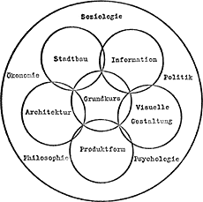
The second way treats critique as a fundamental aspect of the design process. Clive Dilnot, echoing the impulse of design posited by Papanek, states that the critical move is an inseparable part of design in that it constitutes the act of deciding what is and what should be. To discern what is lacking in a given state of affairs is already to decide what could be and this informs the direction of the design activity. A key example can be found in the Ulm School of Design, an unofficial successor to the Bauhaus, which made it a founding principle to consider design a moral act. First among the criteria for any endeavour was the assessment of how the project would benefit humanity. Human need was analyzed and incorporated into the entire process of concept generation, form-making and production. The structure of the school, framed by Otl Aicher, Max Bill and others, instills a constant evaluation of the design activity through humanist terms (such as, sociology, economy, politics, psychology, philosophy).
The incorporation of critical thought and humanistic goals into design pedagogy marks a defining moment in the development of the design field. The impulse has lost out, however, in the age of designed obsolescence, conspicuous consumption and Moore’s law of computational power, which is characterized by rapacious production and disposal of designed objects. In this climate, design has been and in many ways continues to be, the purveyor of perceived difference (between products and brands) and the creator of new needs in the service of a growth economy that requires constant renewal. Glen Hill, citing Gianni Vattimo, suggests that “in a consumer society continual renewal (of clothes, tools, buildings) is already required physiologically for the system simply to survive. What is new is not in the least ‘revolutionary’ or subversive: it is what allows things to stay the same.”[3] Needs in this context become effects of the system and thus help reproduce the system.
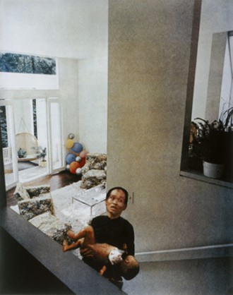
This reassessment of needs and where and what design is oriented towards represents a breakdown in the conventional logic of design that mirrors a recent trend in critical thought. Jacques Ranciere suggests that the critical enterprise has experienced a reversal effect in that the logic embodied in critique and anti-critique is unproductive in a progressive politics. Both modes are based on the logic of unveiling a hidden truth which assumes ignorance on the part of the viewer and relies on the guilt of inaction to produce its effects. Ranciere’s analysis changes the way we understand the work of certain designers. Van Toorn, for example, uses collage as a principal means of deconstructing images and concepts carried out in the popular media. Adbusters’ culture-jamming strategy also often uses collage. Both function very much in the mode described by Ranciere: images collide in order to portray a before and after, or an illusion and truth. This kind of “critical” collage work leaves the traces of the act of assembling images and so further hints at the constructed nature of media messages. According to Ranciere, however, it exemplifies the way that critical art can be mired in an endless loop of unveiling and guilt. Ranciere uses the example of Martha Rosler’s “Balloons,” part of the “House Beautiful: Bringing the War Home” series (1967-72), as an illustration of unmasking a truth (in this case, the contradiction between an American way of life and its foreign policy) and its attendant effect of producing pathos and guilt for our inaction in the face knowing about such injustices.
In its stead, Ranciere advocates for a kind of critique that looks beyond the reality/illusion and action/inaction dichotomies. He states that “at the heart of this approach is the attempt to uncouple the link between the emancipatory logic of capacity and the critical logic of collective inveiglement.”[4] This bears an echo of Bruno Latour’s argument for raising the ethnographic informant’s account to the same level of importance as the sociologist’s. Rather than treat them as dupes formed by fetishes (Latour) or the imbeciles trapped in Plato’s Cave (Ranciere), the actors, both networked and political, must figure as relational agents capable of effecting change. It is this stress on the relational structure of aesthetics or networks of actors that is at the core of the alternatives to traditional critical theory offered by both Latour and Ranciere.
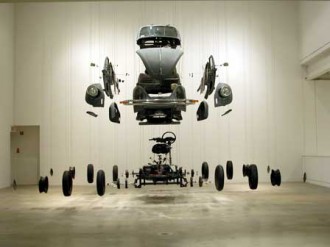
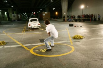
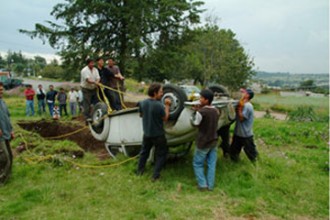
One of the fundamental ways to help understand the current weakness in critical thought, as posited by Latour, is working with a distinction between “matters of fact” and “matters of concern.” Facts no longer hold the privileged position of absolute reality. A plurality of actors has rendered facts as concerns that at times become more stabilized or more controversial. Latour takes up a strategy of assemblage as a way out of the bankruptcy of the critical enterprise. Borrowing from Gilles Deleuze and Felix Guattari, Latour describes networks of actors as assemblages and underscores the importance of associations between non-humans and humans. Rather than creating a collision of representations in order to perform an unveiling of an illusion, as Ranciere has shown in examples of collage, assemblages highlight the careful piecing together of heterogeneous components to mark their connectedness. For example, “The Beetle Trilogy,” (2002-2005) by Damian Ortega, works through three relationships to an object. The Volkwagen Beetle, in Ortega’s series, is disassembled, fought against and buried. Each action highlights the relationship between the technological object and the context of its existence. In one phase the car is dismantled and presented as an exploded-view. While in two others, the artist engages in a tug-of-war with the car and performs a ritual burial of the car with a community of helpers.
The gathering of relations between human and non-human actors represents a relational turn that is also seen in the work of Ranciere. While Ranciere wishes to point out the relational character of how aesthetic experience is distributed, Latour points out how various entities work together to produce stable networks. Latour’s project is committed to creating richer accounts of the networks of actors that configure human lives, technologies and environments. This amounts to a descriptive act. On the other hand, Ranciere’s position advocates a new political involvement that does away with a critique of the machine and instead focuses on how image and action are intertwined in a “dissensus” or distribution of aesthetic experience. Dissensus, he states, “is an organization of the sensible where there is neither a reality concealed behind appearances nor a single regime of presentation and interpretation of the given imposing its obviousness on all. It means that every situation can be cracked open from the inside, reconfigured in a different regime of perception and signification.”[5]
Finally, dissensus echos another aspect of Latour’s logic — the notion of style. A much scorned term in the politics of authentic and responsible design, style evokes the idea that the surface is emotional, fleeting, superfluous and, most importantly, wasteful, in the sense that it depletes valuable resources in the pursuit of (brand) difference. But style can also be taken up as the particular manner in which something is described or assembled and thereby resists a temptation to promote a totalizing view. Similar to cognitive styles, research approaches or styles of resistances, the notion of style is pluralistic and allows for multiple arrangements and configurations to be added to the pile. This is in contrast to the iconoclastic impulse of critical thought which seeks to destroy past orthodoxies and erect new ones.
Within design this relational turn can be summed up as the fact that design keeps designing. For Tony Fry, this notion seeks to highlight the way that objects are designed to affect human behaviour and frame human action which ultimately frames further design activity. Similarly, Anne Marie Willis’ notion of “ontological designing” evinces this trend towards relational thinking when she suggests that design influences the act of designing. As Willis explains, “here is ontological designing – based upon a circularity, in which knowledge comes to be inscribed by being with the ‘designing-being’ of a tool, this in turn modifying (designing) the being of the tool-user.”[6] Fry expands this by stating that everyone is a designer (in the sense that they plan and carry out actions) but that everyone is also designed (in the sense that they are affected by the various affordances of designed objects in their use and in their environment).
Similarly, Latour asks us to look at an object as a project, by which he means that objects are gatherings of multiple actors and themselves participate in larger networks of actors. Similar to Fry’s contention that design keeps designing, Latour reminds us that objects mediate human intentions and act on the behalf of humans to the point where a network of actors (human and non-human) act upon human actors. Latour looks to styling or re-styling as a way of capturing an aspect of design that repairs and rearranges rather than creates. Latour suggests that the word revolution be replaced with the word design: where revolution embodies “detachment, modernization, progress and mastery,” design embodies “attachment, precaution, entanglement, dependence and care.”[7]
As the usefulness of critique is brought into question, the usefulness of design is also drawn into question by virtue of their compatible logics. By comparing the assessments of critique by Latour and Ranciere we can see that both theorists share a similar logic of flatness, interconnectedness and agency. While Latour removes the opposition of real and illusion by emphasizing the assembly of things (images, objects, people, etc.) through “matters of concern,” Ranciere emphasizes struggle and the friction of multiple sites of representation and action in the “dissensus.” Design, through these conceptions, can find a way of stepping away from devising teleological concepts, pursuing universalist, transcendent or essential forms, and resorting to hierarchical structures of power. The appeal to contingent processes and a relational logic, as espoused by Latour and Ranciere, is also seen in the work of Fry and Willis. This shift points to a mode of designing that steers away from notions of uncontrolled growth and novelty and towards small steps and thoughtful reconfigurations.
1. Papanek, Victor. Design for the Real World : Human Ecology and Social Change. 2nd ed., completely rev. Chicago Ill.: Academy Chicago, 1985. – page 6
2. Horkheimer, Max. Critical Theory : Selected Essays. New York: Continuum Pub. Corp., 1982. – page 244
3. Hill, Glen. “Design Without Causality: Heidegger’s Impossible Challenge for Ecologically Sustainable Architecture.” University of Technology Sydney, 2007.
4. Rancière, Jacques. The Emancipated Spectator. London: Verso, 2009. – page 48
5. Rancière, Jacques. The Emancipated Spectator. London: Verso, 2009. – page 48
6. Willis, Anne-Marie. “Ontological Designing.” Design Philosophy Papers 2 (2006). http://www.desphilosophy.com/dpp/home.html. 2 (2006).
7. Latour, Bruno. “A Cautious Prometheus? A Few Steps Toward a Philosophy of Design (with Special Attention to Peter Sloterdijk).” Falmouth, Cornwall UK, 2008. http://www.bruno-latour.fr/sites/default/files/112-DESIGN-CORNWALL-GB.pdf.
An earlier version of this paper was presented at the UAAC 2011 conference, Design as a Wicked Problem, Ottawa, 2011.
Critical theory appears to be on the wane within the practice and discourse of art, architecture and design. This may be attributed to the increasing commodification of contemporary art and “starchitecture” throughout the Reagan-Bush era, ongoing reactionary attacks on left or centrist ideas, and/or the gradual acceptance of a “post-critical” relativism among practitioners and scholars alike. At the same time, a self-criticism from within the left itself questioned the authority, sponsorship and objectivity of neomarxist scholars and artists, the possible fetishism of their antifetishism, as well as the lack of responsibility/vision once the unvarnished truth strips the world to a shell. As the world now shifts into a permanent state of economic and environmental emergency, critical theory appears unequipped. And yet, just as power, through every age, requires art and high design to adorn and legitimate its hegemony, the case for truth, compassion, and solidarity with the marginalized cannot be neglected. Based on an evaluation of Francis of Assisi’s critical-poetic design practice within the political/religious milieu of premodern Italy, a set of strategies will be proposed in this paper for architects and designers here, on the other side of modernity.

[click any image for caption and gallery]
What is the current state of critical theory in design? Mark Jarzombek, Director of MIT’s History and Theory of Architecture program, believes that in architecture, at least, its voice is marginal if not dead.[1] Foucault, Benjamin, Adorno, Delueze and Derrida continue to populate the reading lists for architecture students alongside Tafuri, Eisenman, and K. Michael Hays. However, Jarzombek believes that after Tafuri, most architectural thinkers wrote less in the service to social justice, feminism, or anti-globalization than to serve as a scholarly-sounding veneer for what is otherwise capitalist avant-garde design. Revivals of Bauhaus modernism, Russian constructivism and, more recently, seventies bubble-futurism has driven recent architectural fashion. Where critical theory helped shape a few significant projects in the late 20th c., such as Samuel Mockbee’s Rural Studio, Aldo Rossi’s cemetery-cities, Eisenman and Tschumi’s contributions to Parc de la Villette, or Libeskind’s Jewish Museum in Berlin, its discourse throughout the profession has largely been discarded for an unapologetic embrace of computational wizardry to churn out green-washed, media-soaked fetish objects on a vast scale.
Witness contemporary Dubai, Shanghai, or any of the recent Olympics. Perhaps all this is to be expected given how expensive architecture is as an art form, including having to negotiate often unprogressive urban regulations, building and ethics codes, client needs, an often unscrupulous construction industry, media campaigns and tight deadlines. As in a Hollywood blockbuster, the credit list for architecture could run for hours, but unlike film, there is little opportunity for on-the-fly, radical low-budget creation. There are just too many people that need to sign off on a public built work.
Architecture, however, is not the only medium through which critical theory, radical or neomarxist thought has been largely unrealized. Hal Foster, Fredrick Jameson and others admit that commodification continues to smother contemporary art and design production from the outset.[2] Given that Marx himself believed that capitalism was not to be demolished but surpassed, then cultural producers are now advised to work critically within capital to create what Adorno would term “authentic” works unmotivated by self-promotion or profit.[3] Indeed, Jameson has given the left much hope in his call to augment capitalist critique with the need to explore utopian visioning at the core of early Marxism. Resisting oppression or ironically allegorizing commodification is not enough; better worlds need to be proposed. Indeed, the argument is similar to the conclusion arrived at by Elaine Scarry in her book, The Body in Pain.[4] To the degree that pain incarcerates a body or, by extension, an oppressed society, is the degree to which imagination needs to be activated as an anecdote for release.
Now, if one accepts Jameson’s utopian proposition, then the significant work done by philosophers Paul Ricoeur, Gianni Vattimo, Richard Kearney and Edward Casey on the phenomenological/hermeneutic imagination might provide a map for a “critical poetics” which can simultaneously resist hegemony while proposing “world’s otherwise”. Within architecture this approach might best be exemplified by selected works of Le Corbusier and Steven Holl, Peter Zumthor, and the masques of John Hedjuk.
But can contemporary phenomenology, as a design practice, escape the complicity of its founder Martin Heidegger with totalitarianism, as we see with Le Corbusier during the French occupation, or commodity-capitalism in the case of Holl and Zumthor’s recent works? Time will judge the social effects of any truly subversive critical/poetic design practice working from within an oppressive structure. Commitment and persistence to justice over a lifetime should probably be the only cause for personal praise. Evading fame, power, envy and capital to remain fully fixed on social transformation only increases the burden of the engaged designer. Early works of strength and poetry can rapidly devolve into a pathetic pastiche for profit as a career unfolds. But, how to remain focused? I want to offer one, albeit brief example of a designer’s oeuvre that might map an approach for the contemporary demands of a critical/utopian practice.
Born in 1181, St. Francis of Assisi achieved a level of fame in his own lifetime that was extraordinary by any standard. By the time of his death in 1226 he had over 5000 vowed followers wearing the same habit he designed and wore, singing the canticles and prayers he composed, and living in the architecture he designed. Since the relics of saints were among of the most valuable commodities in medieval Europe, his corpse was so prized by his native Assisi that the town assigned six guards to accompany Francis during the final months of his life. If Assisi’s rivals such as Perugia stole his freshly dead body, they could build a basilica, attract pilgrims and boost their economy for centuries. Indeed, in his later years people were snipping off portions of his habit for relics while he preached. As a result, Francis was well aware of the impending commodification of his memory and remains, and chose very carefully how to bequeath them to Christendom.
In a time of new artisan trade and mobility within Europe, Francis stood out as an allegory for their ideas, beliefs and struggles. During his youth in Assisi, the town overthrew its German military occupier to form its own commune. As a young man he lead a local troubadour troupe and worked in the medieval fashion industry, travelling to France and importing fine French textiles for sale in the family shop.
After a near-fatal illness caused by being a prisoner of war in neighboring Perugia, Francis began to question his social status, and, to the horror of his family, started to give their luxury items to the poor as he himself experimented with living among them. He was trying out what would become a lifelong project: to reverse the order of his sensual experience so that all that what was formerly “sweet to him would be experienced as bitter”, and vice versa.[5] This led to one of his earliest performances when his father took him to court in 1204 to sue for his inheritance (before Francis could give it all away). Francis not only conceded his loss, but before the entire town he removed all his clothes and, standing naked in the town square, gave those to his father as well. Events such as this were, arguably, the foundation of his fame. He might best be understood less as another poor, wandering preacher of the Middle Ages than the father of multimedia performance art. For Francis, the former cloth merchant, this began with the design of his outfit.
He wanted to imitate a Jesus that was believed, due to a local misinterpretation of some scriptural passages, to be a poor, wandering leper. Leprosy was a European pandemic at the time. There were four leper colonies near Assisi, so Francis moved into one and eventually designed his own habit in partial imitation of leper garb: cheap undyed sackcloth, loosely worn with a rope belt. The recently carbon-dated tunic in the church of S. Francesco in Cortona seems to have been his, and appears in an unmistakable T-shape, as eyewitness accounts from the time verify.[6] This was probably reinforced by Francis’s preferred prayer position with arms outstretched to the side, or as was once recorded, lying face down on the dirt floor of his mud and stick hut, arms out in a T-position and two candles burning above each arm.
The T or tau was well known as last letter of the archaic Greek and Hebrew alphabets. “The tau symbol, had, above all others, his preference,” says his contemporary Thomas of Celano. “He utilized it as a signature for his letters and he painted a drawing of it on the walls of all the cells.”[7] The symbol of the tau has a lengthy and complex biblical history as the purported sign and talisman used by Moses and Aaron, and, of course as the cross Jesus was crucified on.
Often living, at first, in abandoned caves, pits, tombs and ovens, Francis appeared in this outfit as a “homo selviticus” or wild man. On his preaching tours, walking barefoot from town to town, his habit became a key prop. Often it was removed so he could demonstrate his naked poverty, or have his brothers lead him away naked, in ropes, like a criminal for his sins. In one sermon for the nuns at San Damiano, Celano tells us that he entered, silently knelt, made a circle of ashes around himself, sprinkled some on his head, recited a penitential psalm, then left. These “symbolic sermons,” as Celano called them, “made a tongue of his whole body.” And the result was not only performative but participatory: all present were reportedly moved to tears, prayer and penance. Indeed, Francis likened himself to the way painted icons were utilized as memory devices at the time. Deploying himself as an icon, his performances included preaching to birds, talking wolfs out of threatening the towns, preaching peace to the crusader’s enemy, Sultan Malik-al-Kamil, and creating the first midnight Christmas crèche in a cave at Gubbio, complete with a manger, hay, live animals, townspeople as actors, and Francis preaching using the curious intonation of a humble lamb, according to eyewitnesses.
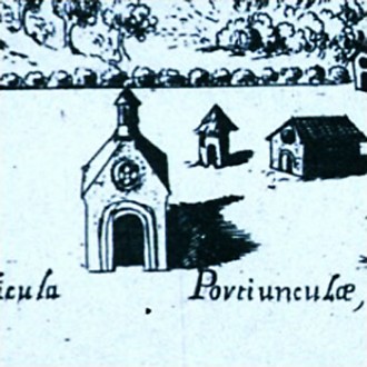
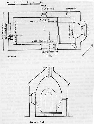
A problem then arose. As his vowed followers grew in number they needed to be housed, forcing Francis to think carefully of how to dwell in imitation of a poor Jesus. After a number of experiments in dwelling, Francis came upon a tiny, abandoned chapel in an oak forest that he renovated himself in 1205-06 by begging for stones from locals. Around this chapel, called St. Mary of the Portiuncula (or the little portion) he and a dozen or so of his earliest brothers dwelled in mud and stick huts and had a garden in which Francis insisted that vegetables, flowers and weeds would grow together. Silence would reign within the hedge-bound friary, except, as Francis specified, for occasional exhaltant bursts of joy. In 1216 European pilgrimage routes changed to include the Portiuncula because Francis obtained a unique papal indulgence for the forgiveness of any mortal sin, like murder, upon its pilgrim-visitors.
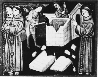
For Francis, the Portiuncula compound acted as a template for all future architectural construction for the order; reports from Italy to Germany to England of friars living in mud and stick huts and praying in borrowed tiny chapels no bigger than the Portiuncula continued until his death. However, opposition to these poverty restrictions, which included his prohibitions on ownership of books and the touching of money, grew louder as his order began to attract scholars, clerics and wealthier followers. When Francis returned to the Portiuncula after one preaching tour, he found a new stone and tile building there to house the friars. Francis leapt onto the roof and, before his brothers, demonstrated his displeasure by tearing it down by hand.[8]
However, as the papacy began to support–against Francis’ wishes–the order’s moderation and clericalization, Francis quit in 1219 as the Minister General of the order he himself founded. In his final seven years, he nevertheless redoubled his efforts in preaching/performance tours to convince all people to reverse their sensual preference for the bitter over the sweet, culminating in his careful and lengthy preparations for his death. He designated the Portiuncula as the place he wanted to die naked on the bare earth, and even had a dress rehearsal, or should I say undress rehearsal, a few days before. Dying naked was important because that would reveal for the first time his stigmata–the five holes in his hands, feet and sides which, although verified by independent witnesses, were probably the result of a holy self-mutilation. Canticles, food, candles, shrouds and a head pillow were all prepared to his specifications. Although he was not a priest he performed a mass that he designed, bestowed blessings on his successors, and, most importantly, delivered his final Testament, which he drafted and edited months beforehand.
Here, in this extraordinary tableau or performative icon, Francis reinforced his architectural vision: that his brothers should dwell as “pilgrims and strangers” and resist ownership of churches and buildings.[9] This section is prefaced by a quote from the Acts of the Apostles which he applied to himself: “And I worked with my hands”, claiming that all his brothers should do honest work, even if not paid. This was in direct confrontation with the order’s new direction to be scholarly, monastic and priestly, living off donations, and thus not needing to “work” like real lay people did. Resisting building and book ownership, refusing to own the tools of their trades, or take on any authority or leadership roles in the workplace were all intended on making his order into permanent day laborers, apprentices and journeyman, with no food stored up for the next day, as per Jesus’ words. This was the vita of the early order which continued, in various Franciscan communities, at least twenty years after his death. The Testament gave those workers hope.
Previously, such utopian social visions were only found in monastic and hermit groups, walled off from the world, or among some of the heretic groups like the Cathars operating in Europe at the time. They all knew that there was something intrinsically good for the human spirit about non-profit work, in particular hand-work, done in service to–and not to have authority over–a community. The Franciscans were among the first Catholic monks-in-the-world, and contemplatives-in-action. Their mendicant itinerancy, having nothing for the next day, ensured a daily encounter with their mortality, dependence on a benevolent cosmic order, and the practice of gratitude. It is hard not to think of these values as consistent with the best of contemporary Marxist or socialist ideals, and providing an example of personal commodity resistance for the long-haul.
As designers or architects interested in seeing the best of critical theory shape our practice, we might do well to focus, as the early Franciscans did, less on the product and more on the process of production. In this way the Occupy movement was not far off the mark as an art form that embraced critical theory. Their hand-built, low-tech, leaderless tent-cities, their chants, puppetry, noise-makers, signage and clothing, were performative vehicles for a greater idea, not necessarily products in themselves to be sold to raise money for the cause. Persistence in their ideas may only come about through a combination of integrated grass-roots organizations combined with personal daily contemplative practices to keep it humble, reduce self-centeredness, resist branding, and to learn about the elders and prophets who walked the same path. This personal practice is just as important as the social practice, and without self-discipline (what Francis called penance), the Occupy movement will likely go the way of their hippy parents who largely transformed into yuppies.
As for the product, consider the examples of Francis’ Tau outfit or the Portiuncula. They were open-source designs of recycled, simple materials which were hand-worked, non-specialist and easily repaired. Most importantly, however, their designs utilized metaphor over allegory, opting for the thick symbolism of poetics rather than a single-message one-liner of a jester (such as Warhol, Hirst or Koons). Just as the Tau transforms the wearer into a crucifix, or a healing Hebrew talisman, or an apocalyptic sign or final letter of a sacred alphabet, so did the Portiuncula, with its hand-built, starry vault carve out a little portion of heaven in the silent joy of the penitential wilderness: the womb of Mary’s Annunciation and the cave-tomb of her son’s death and resurrection. Well-deployed metaphor ensures historical resonance, and invites participation. If contemporary critical designers have focused too much on the product over the production to realize their success, neo-Marxists as a whole might be focused too much on the system over the symbol. Without poetics in design can solidarity with the marginalized persist for the long-haul against adversity, right-wing opposition or capitalist commodification?
-
1. “The State of Theory” in Architecture and Theory: Production and Reflection, Luise King editor. (Hamburg, Germany: Junius Verlag, 2009): 262-273 (262).
-
2. Hal Foster, “Post-Critical,” October (Winter 2012): No. 139: 3–8; Fredric Jameson, Archaeologies of the Future. The Desire Called Utopia and Other Science Fictions, London (Verso, 2005).
-
3. See “Capital as a Revolutionary, but Limited Force” in Karl Marx, The Grundrisse (New York: Harper & Row, 1971), 94-95.
-
4. Oxford University Press, 1985.
-
5. 2 Cel 9.
-
6. La Provincia Toscana dei Francescani Minori Conventuali, L’eredità del Padre. Le reliquie di s. Francesco a Cortona a cura di S. Allegria e S. Gatta (Padova: Edizioni Messaggero, 2007).
-
7. 3 Cel 3; 3 Cel 159.
-
8. 2 Cel 57.
-
9. Test, 24; LR 6.
A version of this paper was presented at the University Arts Association of Canada Conference, Montreal, 2012.
The Art – Architecture Complex by Hal Foster is a book concerned with contemporary architecture and design, a subject I am vastly under-qualified to critically pursue. How I could venture into this task without the requisite specialization is best explained by my conviction that marginality with respect to such specialization is sometimes preferable to expertise. And it may well be that both art and architecture are fields too important to be left to their professional defenders. And anyway, if Foster’s observations are accurate, architecture has itself been dissolved, our ways of building and dwelling transformed into cinematic encounters under consumer media’s management.
With this title, The Art – Architecture Complex, Foster invokes that sense of capitalist conspiracy first expressed in the 1960’s phrase “military/industrial complex.” The book is massively informative but characterized by the author’s trademark polemic with regard to the pluralism that is post modernity in general. Foster has long made clear his preference for purity over plurality. Here, his target is the current work in design produced by “starchitects” such as Frank Gehry, Zaha Hadid, Jean Nouvel and others, whose activity Foster terms “image building” and “pop civics.” Foster indicates his awareness that his view – that the spatial arts have been co-opted by spectacle, and theatricalizing narrative, and that they have become mere “decorative design” – will be received as yet another puritanical gesture from “old socialism.” He likes to refer to these designer’s productions as “commercial pursuits” and to Rem Koolhaas as a “dandy.” There may, however, be traces of Foster’s own perhaps defensible star-gazing to be found between the lines here in that Foster perhaps objects too much.
By “image building” we surmise a reference to the seminal essay Society of the Spectacle written by Guy Debord in 1967. “Capital” and “spectacle” are the concepts by which Foster navigates the tyranny of contemporary culture. Why not take the first few lines from Debord’s book as predictive: “Everything that was directly lived has moved away into a representation.” (1) This still seems close enough to a description of our current situation, although what it means and how it came about is debated. For Foster it seems adequate to blame “capital” and to rest with the predictable commitment to a theoretical perspective drawn from the Frankfurt School.
Following Debord’s thesis, apparently there was once a time when the world was “directly lived.” Applying this to architecture, we could argue that, in former times, buildings were not constructed with “images” and surfaces, or facades, but were in the round and made of substantial stuff like stone, glass and steel. That is, their materiality was bodily, although understood in the sense of a physicality that stops short of recognizing “flesh,” that wonderful term of Merleau-Ponty’s that now encompasses the electronic environment.
This metaphysics, the foundation for Foster’s criticism in general, is oppositional in form. He typically opposes resistance and transgression to complicity, outside to inside, the real to the illusory, and the virtual to the actual. This marks a limit to his analyses and, for some, renders his conclusions helplessly conservative, even though his objections to “capital” might seem necessary. This is the crux of his situation; critical for his historical consciousness, conservative for the same Foster’s oppositionality leaves him without traction with regard to a historicity of experience now re-composed by way of electronic “abstraction.” In this new situation, Foster refuses to acknowledge how antiquated his use of “the image” and “spectacle” has become, clinging as it does to some notion of an objective foundation, a reality that would offer an external standpoint from which critique proceeds. His fervent conviction that there is an “outside” with which criticism can orient itself and from which critical attacks may be mounted – the “distance” definitive of criticality – fails to account for and integrate the pluralizing impact of electronic communications media with which the post modern [contemporary?] is to be identified. Even a likely sympathizer such as Bruno Latour asks, “Are we not like those mechanical toys that endlessly make the same gesture when everything else has changed around them?” (2)
Foster’s attitude with regard to electronic media culture makes him a traditionalist. Another writer afflicted with what is often called “Benjaminian nostalgia,” the historian of architecture, Kenneth Frampton, invoked a practice he called “critical regionalism,” in which architechtonics, truth-to-materials, site-specificity and other such dreams of the decade were the key aspects of building. His essay on the topic was included in The Anti-Aesthetic, a 1983 anthology edited by Foster. (3) Here, Frampton lays out a heartwarming defence of real things, place as the here and now, and an actuality that is understandably founded in a longing for “the” body. The phenomenological version of realism adhered to in Frampton’s essay runs right up against the theorizations of media expressed in my own favoured text on architecture, the interview between architect Jean Nouvel and Jean Baudrillard. What is perhaps intriguing is the parallel between Foster’s perspective, which targets the use of digital media in so far as they are the tools that have facilitated architecture’s having become image and that of the Nouvel/ Baudrillard dialogue, in which the electronic media facilitate a general dematerialization and a world without “outside.” Baudrillard, informed by the media theory of Marshall McLuhan, developed a more “performative” vision of architecture’s relationship with new media. Although the literary character of his thought has often been anathema to traditionalists such as Foster, his observations are acute if expressed in apocalyptic language. His willingness to embrace the media as environment means he spends less time spinning his wheels positioning critique somewhere that is no longer available as it was in the nineteen eighties.
Perhaps what is needed, following Foster’s denunciations of design as mere consumerist manipulation in the service of greater efficiencies for capitalism, is recognition of a more general outline, an outline that attributes the root of the problem more deeply in a description of the rationalist prejudices that dominate our thinking and being. For the style of critique demonstrated by Foster and his colleagues this would be bad news, leaving them revealed as a part of the problem in so far as their project is itself inextricably dedicated to the founding of criticality in a modernity that is already itself a practice of instrumental rationality. In this sense, the critique mounted from Foster’s “leftist” optimism has become a rearguard defence inevitably and finally supporting and requiring those elements of purification and linearity so essential to the drive of technics (including capital) for ever greater efficiency.
1. Guy Debord, Society of the Spectacle, trans. unidentified, Black and Red, 1970, Detroit, 5
2. Bruno Latour, “Why Has Critique Run Out of Steam” in Critical Inquiry, Winter 2004, University of Chicago, 225
3. Kenneth Frampton, “Towards a Critical Regionalism,” in The Anti-Aesthetic, ed. Hal Foster, Bay Press, Seattle, 1982
4. Jean Nouvel and Jean Baudrillard, The Singular Objects of Architecture, trans. Robert Bononno, University of Minnesota, 2002
]]>
Andrew Forster: Yesterday I went to the Storefront for Art & Architecture. In the back there is a set of books that you picked out. Is that a recent thing?
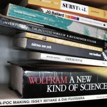
Vito Acconci: No it was before the current director was there, before her was a person named Joseph Grima (who is now actually the editor of Domus magazine). I don’t remember how it started for him, but he asked a few people to give him a book list and the book list would turn into a little book store, at Storefront. I don’t know If I remember all the things I put on. I know I probably put, because this is a very important book for me, a book … a book that I know I got … I got a lot of books in the late 60’s, in the mid to late 60’s, from getting clues from the Whole Earth Catalogue.
AF: A survival guide.
VA: Yes That’s exactly the one I’m talking about. This kind of ‘how to survive’ book which has chapters on different challenges…
 [click any image for caption and gallery]
AF: Loneliness, cold, etc…
VA: Yeah, which is great, beautiful chapters; too lonely, too hot, too cold… But it’s serious in a strange way… but it doesn’t leave out humour, but at the same time, and I think that’s a real keynote for me. I think comedy is more important than so-called tragedy. I think comedy gives you… I think when you laugh it probably means you’ve had a second thought, you’ve reconsidered something, and I think that is kind of my goal. I don’t know if it always was but… But yeah… even… I thought pieces I did in the late 60’s, I thought the performance pieces where funnier than other people did.
AF: There is a sense that your work since the 90’s, the architecture work, the public space work, that it is getting beyond a sense of transgression that comes out of visual and performance art… That is no longer a singular persona of an artist as shit-disturber, under-miner of all things, but that there is a different mode which is a mode that somehow relates to making demanding gestures in the area of design…
VA: It probably is. It’s different. If I can say what I want our architecture to do (and probably it does, or it tries to do more than one thing). But what I hate about architecture (and I love architecture!) is that it forces you to do things and my goal (and we certainly don’t know how to do it) is something else.
What started in the 80’s was when I talk about stuff I used to say ‘I’ and then I had to start saying ‘we’ because it’s a group of people working together, and the group changes. The group has changed over the years but ‘we’ became important because I thought when I thought I was doing architecture I started to think I have to work with other people, because I don’t think architecture can come from a single viewpoint. It has to come from a group of people thinking together, talking together and especially arguing together. I think this condition is important. I want architecture to have loose ends, because if it doesn’t I don’t know why anyone else would want to be there.
The big problem with architecture is it determines your moves you know you go through a door, sometimes you want it a few feet bigger. And there are ways to do a changeable architecture, but it usually… and we’ve done it, Storefront is somewhat that way, where it has hinging parts, but that is not real freedom, that’s like supermarket freedom… you can do everything you want as long as your supermarket carries it…
AF: You say there is a sense of humour in Storefront for Art & Architecture [designed in collaboration with architect Steven Holl, 1992-3]. When I first looked at pictures of it, I thought of the Buster Keaton movie where he is building the house [One Week, 1920].
VA: Buster Keaton is a very important, Samuel Beckett and Buster Keaton are almost the same thing. You probably saw the movie Samuel Beckett made with Buster Keaton [Film, 1964]…
AF: Yes, yes. In One Week Keaton builds a pre-fab house without instructions, but mis-builds it. Its completely wrong… you open up a door and its got the sink attached to it, now on the outside of the house. Things like that. Gags based on displacement and physical discomfort. There is something like that about Storefront for Art & Architecture, it’s like a door in a small room, that you open the door but that makes the room too small to get your body around the door, not at all making the space more efficient but creating an opening by a kind of inefficiency.
VA: It makes an opening, and it probably, and it possibly provides walls, perpendicular to the existing ones. But it provides a change, but I don’t know how much it’s used. I think it’s used more now than it was for a while with the new, relatively new, director [Eva Franch].
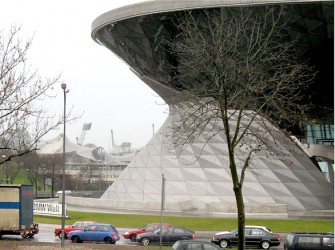
AF: You said that the visual or the image is a problem in architecture, that magazines create a problem in that they freeze time with images of buildings and space. I had an experience when I went to BMW World in Munich [Coop Himmelb(l)au] with its twisty façade.
VA: Yeah, I’ve seen it in pictures.
AF: What it made me think about, or fear, is this thing that in a lot of architecture that is made on the screen is that it’s all facade, so there is this thing this twisty thing it’s this extraordinary image you see as if it is a photograph but inside it is conventionally built. The façade or image is the experience.
VA: Yes, but it doesn’t have to be, the outside can shape the inside and vice versa. I mean I admit we have gotten involved with the twisty things too… It’s hard not to, working with the computer. But just quickly, the thing about twisty things, is I think what fascinates a lot of people using it, is the continuity of it, it’s topology. And it’s that you can go from inside to outside and back again. We got obsessed with things like the Klein bottle…
AF: For sure, but here is the thing about visual. Its that there is a certain kind of architecture that is very visual in a specific sense, that is exclusively about what it could be as an image. And it makes me think about pornography, actually. That it is pornography. That we look at a building and we have a fantasy about how we can live like this, but it’s not about something that ‘is’, as when you talk about Jasper John’s text painting as ‘fact’. This is not ‘fact’ or substantial in that sense, it’s like this… hmm, it’s hard to put it in words… but there a sense that it’s connection to stuff is just image, purely for the eye.
VA: Yeah, yeah.
Even though its built for the world, in space. Its…
VA: …just image. Just image is hard for me I want image to be useful, you know, I want image to be, you know, can you be in the middle of image — then it’s not image anymore, because it’s not. It’s not in front of your eyes, it’s, you know… and maybe if I try to deny it, the notion of, the notion that a bodily experience of something is important to me, yet at the same time now I keep thinking I am not against virtual experiences either. There might have to be a mix, maybe some of the kinds of things we really want to do can only be done virtually. But I always think, virtual: virtual is an anticipation of the future, you can’t do it now, but if we do it virtually, people will start to think well why can’t we do it? And maybe eventually you can. I mean I won’t be alive, I don’t think, but, I think the architecture of the future will probably be movable.
That every time people are so against something, it’s a clue that this something isn’t going to exist anymore, so all over the world people are terrified of immigrants, probably means that at some point there aren’t going to be national boundaries, there aren’t going to be immigrants, people can go anywhere…
AF: Do you find design students are different from art students?
VA: Yes.
AF: You give an art student a project, it’s about some kind of expression? You give a design student the same project and maybe they’re not in the problem in the same way, it’s a problem that other people are having, for better or worse…
VA: Yeah, though there are some architecture students who get obsessed with this [expression] problem, these kinds of problems. A big difference, I don’t know if this comes from training in schools, but if you ask an architecture student, why did you do this? They try to say why. Whereas art students, they say gee, I don’t know. And even when I ask things… I admit, art students exasperate me. I say, why did you put it horizontally rather than vertical? They say, I don’t know. I say, you have to know. Why did you make it that size? It’s interesting… ‘they come that size’. They almost don’t like to give reasons, reasons ruin it. Reasons were always important to me. I mean certainly when I was doing art, I wouldn’t have done it without reasons. I mean, I know why I was doing the work I was doing in the beginning…
AF: Contemporary art can ask questions down to the grounds of thinking and doing. Design builds to any program. There is a resistance to seeing these two modes of thinking collide. Design doesn’t do failure and art deliberately problematizes notions of usability. Perhaps that contradiction is useful. Can design be critical in its practice or its production in the real world, in a way that art, confined to a hermetic system, cannot? Art lives over here in the museum, we can ask of art questions in a kind of ‘it is as if’ way… And design? What can it do?
VA: The fact that you said, and this is true, art is in the world of gallery and museum, but it’s kind of an enclosed world, maybe it can touch on other things. One reason why I started to do what I thought of was architecture in the mid ’70s, when I was doing installations in galleries or museums, I started to think I think I‘m in the wrong field, I don’t want to do these projects, where only people, who are for whatever reasons for some reason or other are only involved in some kind of art world. I want do something where somebody goes into or stops in, not because it’s art, but because for some reason or other they’re intrigued by this, or maybe they hate it. I don’t want them to go because it’s art. I want them to go because somehow or another, I, the person in the street, have walked down the street, and I say, ‘what’s this?’ And I turn and go… that’s kind of ideal for me. I don’t like the idea of… I wish things would never be labelled exactly.
You probably know that most of our projects aren’t built. I mean, is that purposeful? It’s not that we don’t want things to be built, but we don’t just want to build anything. And it’s probably important. When I think of, I came to architecture kind of late, and certainly in the early 70s, I was thinking God, I can’t stand architecture, I can’t stand these city buildings, etc… Somewhere there was a change. But I think the change was that I realized, I’m not so interested in space, I’m interested in people in space. That’s a big difference. But when I think, who are the architects through the years who probably meant something to me. In the 18th century, Boulez and Piranesi, and in the 1960s, Archigram… probably not one built project there, but a lot of ideas!
I thought you could do design, it could thicken the plot. And that, you know, is as a maze useful? …I think it is. You can certainly get to a destination quicker without a maze, but there might be things along the way that you wouldn’t get if the maze wasn’t there.
AF: I’m trying to pinpoint what this idea of criticality is, that is so limited when it’s carried out in the art world. Yet it’s also compromised when it’s carried out in the world of architecture and design, but at least it’s in collision with something. It’s implicated. Do you have experiences doing design projects, when the resistance is too much?
VA: [that…] we probably aren’t going to put it up, because people won’t let us put it up. But I admit, we’ve done things for… a proposal we did for a competition, maybe 2005-6, a competition for a library in Guadalajara in Mexico. It was an open competition. We certainly weren’t chosen, even as a finalist. But we were very struck by the site. Because right next to where this library was, there was going to be… there was a large street, almost like a kind of small highway. So we proposed, we’d start the library by stepping down, into the ground, making a kind of maybe a courtyard. Once we get down, we start step up, to make the library. But as we start to step, we can’t resist that street. So we go over the street, into the rest of the city. Then we thought, oh, why don’t we use this as a kind of expansion system for the building.
Did we seriously believe that anyone would accept that? No. But it gave us a chance to think. I think design is much more about… to anticipate the future. That’s more important to me, it’s certainly more important to me than if someone says yes you can build this, but you can’t do this part. Well, don’t just do parts. Where you say, oh there’s seven parts, let’s do three. I’d rather get something refused. Again, I think of Piranesi, I think of Boulez, I think of the 60’s Archigram.
The thing about Archigram that I like is that they make things look so specific that you say, of course they could be built. Some of them might not have. But specificity is important. I have blocks against certain things. The Situationist, Constant. Not that I don’t look at them, but, for me that stuff is so flimsy, so vague, compared to Archigram, where I can see this down the street. This isn’t in somebody’s mind. I don’t mean it’s not that I don’t take them seriously. At the same time, it’s that I don’t get it, just like I don’t get Superstudio. It’s too abstracted to me. It’s almost as though they’re pulling one over you.
AF: Is it because it’s not grounded in a potential tangible experience?
VA: It is, certainly, and again, it has some of it has the clarity of Archigram, but in a different direction. This is making concrete a kind of abstract thought. I don’t know, sometimes I go woozy with abstract thoughts. I mean I love abstract ideas. I hate abstract words. Abstract words just contain too much. I want to get specifically, and maybe in a lot of different directions, to an abstract idea.
AF: The Munich piece, Courtyard in the Wind. For me it’s interesting because it’s still an ‘art in architecture’ piece.
VA: The problem is most of the projects we get to do are so-called public art projects. We’ve very rarely done architecture projects. Mur Island was probably the closest.
AF: Certain artists specialize in ‘art in architecture’ projects and some get very good at producing them in a way that they fit in. The system of generating art in architecture is a one-percent scheme with the criteria that something has to last for so many years, etc. – it has to ‘behave’ properly. There’s always this push and pull, of wanting to do something interesting, experientially or otherwise, and doing something that isn’t going to cause problems.
VA: I admit sometimes, I can’t say we’ve gotten away with something… it’s no secret. Sometimes. Like the subway projects, no other subway project is like this, and I don’t know how we were able to do it. One is Coney Island, and one is 161st Street… where we took the subway tile, and raised it up through the ground, so that it becomes a bench made of subway material right in front of McDonald’s. The seating is made by taking subway tile and sliding it down and forming seats. Do people notice that? They probably just say it’s a place to sit down. Maybe one person every now and then does a double-take.
AF: Back to Courtyard: what do you hope someone’s experience is walking through this work. What I saw is that the city workers in those civic buildings come and go through the piece to the station.
VA: The way I saw it, you’re opposite, you’re inside the building, you look out, you see there’s a tree there. Now you look out again, and you realize oh the tree’s over there. Or I stand opposite to you, I blow my nose and now you’re somewhere else. In some ways, more than some of our other projects, it doesn’t particularly have a use, except to lead to a kind of double take. Where you thought landscapes were supposed to be still. Now it’s moving. I mean, it’s a piece I like. But compared to what it can do for people, I think it can make people laugh. I’m not sure it can do much more.
I know the way we started it, the site we were given was this courtyard, and the building department that was going to be renovated, it was clear there was a tall tower in the corner. And we thought that tower is so striking. So we go, the way we thought of it, let’s deal with the highs and the lows of the space. Let’s put something high in the tower, let’s put something low in the courtyard, and one should affect the other. In this case, it’s a one-way direction. Once the wind turbine is moved by the wind, it stores electricity. Therefore down below, this horizontal moves because of what’s happening with this vertical.
AF: What’s the other thing Courtyard ought to do, or could do?
VA: I remember one thing we did, when we started thinking about the piece. At first we thought, we should make this whole courtyard move. But we couldn’t do that. But even that would have just been a way to take something that’s ‘normal’ and in some way turn it upside down a bit or turn it inside-out a little bit. But I don’t know what we could have done that could have made it more useful. Because I like the idea… let’s give something a use, let’s make it have a use. More of a use that wouldn’t have been there unless we had done something.
AF: Courtyard does do a very nice thing in terms of the language of landscape architecture in that any urban park is built on top of a serious amount of city infrastructure. It’s drainage, it’s electricity, it’s mechanics. There isn’t earth down to the earth. It points at the contrivance of those spaces, that they are human-made spaces.
VA: They are. They didn’t happen by themselves. They are designed spaces. Maybe not particularly good design. But designed. If something’s here, and then you put it there, it’s the beginning of design.
AF: An architect or designer exists on the cusp where something particular, or singular, can still happen before something becomes fixed, the last moment before something becomes part of the technologized world.
VA: You don’t think technology can help invention? I think it really can. I think you use the means of the time. I never would have been interested in a so-called virtual space a few years ago. But once I realize those possibilities are there, I start to think, can there be a mix.
We’re doing this project now, it’s being built, a project in Indianapolis [Swarm Street]. It’s a tunnel, a kind of tunnel to a building, it goes through a parking lot. So, what we did was, on the sidewalk, there’s a place to walk, and there’s also a bicycle path. As you walk through, as you cycle through… you activate motion sensors that are above you. There’s a steel structure above you, the steel structure holds literally thousands of LED lights, embedded in the sidewalk, there are probably an equal number of LED lights. So when you walk through, as you activate a motion sensor, you turn on these LED lights below you and above you. So as you walk you turn on, turn on lights. So it’s like a swarm of fireflies that’s flocking around you. Now, if you’re coming from another direction, or if you’re coming next to me, and you start to pass me, now your lights and my lights start to swarm together.
At least there’s this somewhat beginning effort, that, you know, people aren’t doing this purposefully, but as they’re walking they’re activating something. And then, once they realize it, maybe they can start to do it on purpose, or do it with someone else. It’s important for us to do stuff that maybe wasn’t so easy to do at another time. I’m starting to think, I don’t really want to make surfaces. I want to make pixels, I want to make points, I want to make dots. I want to do thick air. So that the thick air becomes buildings to be in, at least temporarily. Of course, I don’t have the slightest idea how.
AF: In an interview you said public art is de-design.
VA: Have we lived up to that? I hope we have. But I wonder sometimes. I wonder sometimes if I’m afraid, do we make concessions without admitting it, because we do want things to happen?
AF: Compromise comes out of wanting to be implicated, in order to be implicated, one makes compromises. One says, how do I fold it differently?
VA: I wonder if I even recognize the compromises sometimes. I hope I do. I think most of the things we propose… For example, the two subway stations – there were no other subway stations that had stuff like that. And I don’t know why, exactly. I think the only reason we were allowed to do it, is that they do provide things for people. Like places to sit, like the west 8th street station. One of the most important things, they said… was, or one of the most important things to them, was that people have to be able to see Coney Island, see the amusement park, see the beach from the subway station. So the one of the first things we thought of was how to we make views. We have a tendency, I try to talk to whoever is in studio at the time, was let’s not start by thinking of windows and doors, let’s start by thinking of openings. If all you need to do or want to do is look, then let’s take a solid, let’s take a surface, let’s split it, but we don’t have to split it that far. We can split it only enough so as you can see out. If you want a door, maybe you want a door later, let’s tear it out. If you had a door there, we would have walk out into space.
AF: Do you go back to that subway station and watch how it’s lived in?
VA: I’ve been there at around 3 o’clock in the afternoon, and there must be a some schools nearby. Because there are a lot of kids there. And they’re sitting. Are they necessarily looking at Coney Island? I’m not sure. Because they’re passing by. The seats are more occupied. Does anybody even notice that they’re different than other seats? That I can never know. If you go with somebody, I think the wrong way to find out what people are thinking is to go is to go up to somebody, and say what do you think?
But we made a bigger mistake. We knew at one point (we didn’t know at the beginning) but we knew as we were designing it, I don’t remember at what stage, we knew that they were only going to do it only one side of the station, the side that faced Coney Island, and not on the other side of the station, which is the side that faced the neighbourhood people. And I don’t think I can ever forgive myself.
AF: I’m kind of intrigued by the idea of second thoughts. Lets talk about Graz… Mur Island. You asked a while ago, about Courtyard, does it do enough? So we’re in Graz, and this island in the river does become a public place. It’s very active, they’ve kept it longer than they planned…
VA: Much, much longer time than it was supposed to be just for…. They probably thought it was going to be much more than the year, that Graz was the European Cultural Capital. They probably thought two years, three years… People seemed to use it. It got screwed up a little bit. In that, I don’t know if after the first year or two, if it was ever used as an amphitheatre.
AF: They did not seem to have programming for it?
VA: No programming for it. It was, for the piece to be done, there was an organization called Graz 2003. Graz 2003 maybe came into existence in 2001, and went out of existence in 2004. So since then there was nobody, supposedly, who owned the island. That wasn’t exactly true, because the cafe and bar was being rented by somebody from the city. But the city wasn’t really taking care of it. Instead of being used as an amphitheatre, the amphitheatre was starting to be used as an outdoor cafe for the restaurant.
You know, it’s what, nine years later now, people in Graz seemed to have gotten kind of involved it in, so that they started this movement that it needs some renovation. And then the city thought, I’m not sure, (it’s amazing how you hear two sides of every story). The city said we need to have theatre events, theatre events during the fall and winter. So we need some kind of canopy for the amphitheatre. Then we heard another version that the person who rents the cafe, thought he would get many more customers, I think I believe that story.
AF: Do you feel that you can exert rights?
VA: You can’t as a designer. It’s very different… but I did get a letter, not from somebody who was responsible for it now, but from somebody who was involved when the project began, and they said, you know, they want to put this roof over it. And he said that doesn’t seem right. And he was right, because the whole thing was about, was based on, here’s a bowl, now there’s a dome. But I can understand, to make the thing more useful, but then I wrote to them to say look, you don’t have to do what we’re suggesting. But give us a few weeks to come up with some solutions. And we did, and I don’t know if they’re going to be followed. But there were things that…there was a roof, that was sort of like these clouds, it would be away from the island, but then on lines of cable could pass over it, and it could be a retractable roof, they say now that they’re going to consider what we’re saying. But that is the thing about design.
AF: What do you think the island does in the city? What it does is significant and ongoing.
VA: Most of it is hearsay for me. I think that I did go back within the first year, and at that time it was really bustling. But I’m sure it’s not bustling anymore. I’m sure the cafe is used more than anything else. I did see some stuff from Graz newspapers was translated for me, where it seemed like people were saying we need to keep the Mur Island going. I did talk to some people. I was very struck when it was first built, and this was even before the cafe part of it was built, people took walks on the island. And I was very struck that especially older people… I always think we lose older people, maybe some younger people become fans of us, I don’t know if older people… but older people seem to enjoy it. I felt that in some way, I don’t know if public space is something that you have to ‘get’. But when they were in the bowl part, and they walked, and suddenly, they looked up, and there was this dome around them, they started to laugh.
And what I said before, that laughing proves you may have a second thought. It seemed that maybe they didn’t exactly get what I got, but something. It seemed like they felt some kind of change. When it was first built, a local pastry shop made a little pastry called the ‘Acconci island’. It was this little twist, you know. So it did seem, you know, and I wanted to, you know, I don’t expect, you know, some every day person who possibly was, you know, but was 70 or 80 years old at the time, laughed, I don’t expect that person to say oh, this is a bowl that twists to become a dome… but they recognize something. That they felt at least some kind of change.
AF: The grid of Graz is very uniform. Your passage is across the grid, a diagonal shortcut. Mur Island creates an angle across the urban grid.
VA: And this was something that I started to insist on, but they wouldn’t let us do. Now it’s too near to an already existing bridge, and I thought, what we proposed first, let’s make it where there’s no bridge. I thought that if we did that, then the land on either side of this new bridge… it might fit into what you want, it might be more developable or something. So I don’t like the idea that we gave in. I can’t stand that later I realize I didn’t fight.
AF: I have a question about aesthetics. Mur Island has a particular aesthetic but looking at your work in general, I think the aesthetic is not the concern.
VA: It comes from something else.
AF: Maybe someone in the office had this knack, or this skill. I look at the models. Today it’s plasticine, tomorrow it’s a nice 3-D rendering. Is the issue really what it does rather than what it looks like?
VA: That is true. I wanted to, and when I say I wanted to have some kind of function, I don’t just mean you could walk where you couldn’t walk before, but I hope it has a function of something that can be transformed into something else, I would rather now do stuff that that people can change. I don’t think we’ve done that enough yet. The Indianopolis thing [Swarm Street] is a very small inroad towards that. But I want people to take architecture in their own hands. I don’t want people to be subservient to architecture, I hope people can shape architecture. I want people to shape architecture.
AF: The questions we were talking about earlier, about the visual aspect, these are things that get in the way of what it does, ultimately?
VA: I hope it doesn’t. I hope the look, I mean I hope, the way this project (Mur Island) started was let’s make a theatre. I wanted one thing to turn into another. Doesn’t exactly turned into another, you have to take this walk, but I wanted everything to come from a bowl. Turn the bowl over, it’s a dome. If one thing was on one side, and one thing was on another, there’s a twist in the middle, that’s the playground. So it started with that… it didn’t exactly start with that. The way we started, thinking we’re doing something on the water, they’re asking us to do what they called a person-made island. At first I thought it shouldn’t have bridges. It should have an underground passage so that this is an island. We couldn’t do the underground bridges, because I didn’t realize how shallow the water was.
I mean sometimes we do start at a wrong direction. I love the idea of an island of water. And I don’t know what to do with it, an island of water. We tried, can we make an island based on a whirl pool? Can we, now I don’t remember what other kinds of water things we did. But it was getting us nowhere. We only got somewhere when we started to think of conventions. When we started to think of what they asked us to do. A theatre, a cafe and a playground. So therefore, it was easy to start with the theatre, because that’s a very conventional shape. Some kind of bowl, bowl becomes dome, in between becomes playground.
AF: That relates to a question I have about architectural processes. Architects always talk about responding to a ‘program’.
VA: What interests us in responding to a program, is that the program usually involves something that people are going to use. So the idea, we do think of a peopled space, so that we can take hints from the program, we like to double the program, or multiply the program, we like it not to have just a single program.
AF: Earlier we were talking about your interest in Jasper Johns, about language as fact. The program is language, isn’t it? Can you play with the program? The program is about trying to fix some set of conditions. The experience that I have is architects often see language as part of the selling of the project, and not part of the source. Whereas your work takes the program and says where can this go, where can we shift it, or unfix it.
VA: Right, now we’re about to start working on and it’s admittedly a public art project. There’s a kind of hollow in a building, and they want this hollow in a building, people can kind of enter this hollow part and they want it to be a place for a time piece. And that seemed general enough for us. But we’re thinking, we don’t know how to do this. I would love us to ask: how can we make this space filled with dots, filled with thick air, and how can that thick air start to fill time? I have no idea, no idea, how. So yes, you could do thick air virtually, but this has to be something where you’re walking through time. You’re walking in the middle of time, you know. Time was like tiny flies, you know.
AF: These are the kind of sources that are in language, that are in the imagination.
VA: Very much.
AF: It’s not material, like ‘we’ll build this one out of aluminum…’
VA: It’s never that.
AF: Does that confound your colleagues?
VA: They’re all architects, none of them are registered architects yet. But that’s a big difference with people ten years ago and now. Then a lot of people who worked for us didn’t care about becoming registered architects. Now, everyone wants to become a registered architect. Also a change of money time, from a lack of money time, I think. There’s an open competition for a place called Freshkills in Staten Island, a former garbage dump. They want to turn it into a park. We’re definitely going to enter that. That deadline is coming closer and closer in July. We’ve worked, at least theoretically, in garbage dumps before. One in Israel [Hiriya], and one in Holland [Breda]. But they both were theoretical projects.
AF: One was a floating?
VA: I liked that. But here, at least in the beginning, the thing about a garbage dump, is that it really does eventually change. Because it releases methane gas, etc… so we want to put something like a Fuller dome, not quite that, so that you’re on this almost like you’re based on a structural system that has a lot of different kinds of pathways, maybe you could eventually go down through part of the original dump. We don’t want to plant something. We want some in-between place. Between this earth that’s covering the garbage dump, and I know we can’t be walking on air, but instead of having trees, or stuff like anything that a park would have, can there be almost be a tree pocket?
AF: A burrowing down through the layers of the dump?
VA: No, it’s almost like having some things above the dump, but very island-like. Above and then maybe something below. Projects do come from, and I can’t say no other firms work this way. (Are we a firm? I don’t know. Can you be a non-money making firm?) I might start a project off with words, with a general idea. But then we talk a lot. We talk a lot. So it probably doesn’t necessarily lose that beginning point. There are, I’m sure there have been some projects that go in another direction once we start to talk. But at least if it does keep that general beginning idea, it changes a lot with the different people talking. That’s why I bring up the, I think collisions are just as important as collaboration. More important. You get to a new idea. You get to a new idea that none of us would have thought about, individually.
AF: Do you think a project that is sitting on a garbage dump has more potential for collision than things that are, like Mur Island, a pavilion, framed in an ‘arts and culture’ context. Even Storefront has such a pavilion aspect to it.
VA: Yeah. The strange thing about this Freshkills competition, is that something’s already been done for Freshkills. It’s very, very basic. A landscape architect did it. But what they calling this stage now…but that was just a kind of rehabilitation project. And now they’re calling this project, strangely, an art project. I’m not sure why. So they’re saying, you know, it’s open to architects, designers, and I’m not sure why.
AF: If its an art project you’re not messing with the systems in some ways.
VA: Maybe you’re right, maybe they’re thinking now this is the entertainment part. Because in the ones in the past, and at least until a while ago, both of the Breda project in Holland and the Hiriya garbage dump, which is somewhere between Tel Aviv and Jerusalem, we tried to find ways to use the methane gas, I don’t know if we have that occasion here.
AF: Sustainability is one area where there’s an opening for a kind of criticality… to insert something that’s more difficult than a conventional approach. Talking about a project in the garbage dump, it’s not about making anything useful, it’s about some other way of thinking through, which isn’t just the proper materials, proper approach, proper systems.
VA: Yeah. I mean the people who tend to work at the studio are the people I say yes to, tend to be people who are more on the side of, ‘let’s at least start far-fetched’, and see what we can do with it. We have had the opposite, and it has been hard. And almost every time we have hired a registered architect, it’s been so much the opposite. It’s like now come on, we have to start a project, by realizing okay this is how much money we’re getting for the project, therefore we can only spend this and this many hours, and I realize, I can’t think like that. I really don’t want to. I just, I get so blocked from the beginning, that I say, we’re never really going to make money on architecture.
AF: I think in the case of your work, you go where the thinking takes you. Whether it’s being a writer, strictly speaking a performance artist, public works, or participatory installations. The thing that strikes me is there is a consistency of purpose, people say he was the guy who did this, now he does this, then he does that, and that doesn’t make sense. I look and you’re work, it is there and then it is here. It makes perfect sense.
VA: I hope it does. Yes. I mean I did want, I’ve felt, I’ve always felt that I’m committed to such… I don’t know if I ever want to say I believe, but that I’m committed in such and such a thing. But then times change, and maybe I need to reconsider.
AF: And the opening for ‘critical’ may now be somewhere else?
VA: I hope you can be critical in any field you’re in. That you can be in the field, but criticize it at the same time. So that that may make you change, or it may make the field eventually change.
AF: Do you think that the field of architecture, the field of design, that you’re working up against… calls for an ‘unfixing’ (when I’m writing about your work I’m using the term ‘unfixing’).
VA: I like that term.
AF: In the sense that there’s a process in contemporary culture. The process is about fixing. Unfixing is to loosen. You say, I don’t know if this or that project worked. Well it’s because the process is always going to tighten it up again as soon as you let it go.
VA: Well we hope we have some control over something that can’t be tightened up. I have done things that I have realized I should have thought more, so that I did object to some of the things. The worst thing I think that happens where we’re working on a project, is that somebody says oh, this reminds me of such and such a project, referring to something we did. So I say, let’s try to change it. Which might not be the best attitude in the world. There’s nothing wrong with doing, maybe a second version of something that you did a year ago, might lead to yes, maybe it’s a second version, but it leads to some new possibilities. Sometimes I wonder if I do have too short of an attention span.
AF: In your work, there’s an interest in the relationship of the body to space, or body to space and time, as unfixed. Which is fundamentally different from master works of architecture and design, where visuality and monumentality, is the primary experience.
VA: Monumentality is a pet hate for me.
AF: So if we are interested in how technology fixes time and space, and our relation to it, we can see with your work a desire to fish out all that is unfixed, all the unfixed moments, as the moments and dynamic in which there is the most at play and the most to be revealed.
VA: Yeah, again, technologies change. Technologies lead to other technologies.
AF: …then lets say the dynamic of the built world, as opposed to the dynamic of bodies in space and time. You seem to always return us to that space where the latter is the primary experience.
VA: Loosening up is much more…in some ways I wish we had the chance, we could demand it… That every few years, we could go to a built project and add something, take something away, change it. That’s why the notion of…I know what, I don’t know if I can say ‘we’ here, but I know that I, the most important thing to me is something that is always changing, once people are using it, and I really don’t know how to do that yet. I want people to be influenced by the space we make and that they’re in, but now that they’re influenced by it, can they also change it? So that maybe, it starts to go away from us.
Maybe we can do that. Maybe we can do that in the garbage dump. And again, I was so struck, when we did those two theoretical garbage dump projects in 1999, the fact that the presence of methane gas really is making this ground move. Maybe you don’t see it in front of you, but…
AF: You also seem to try to not making things user-friendly. User-friendly is a term that come out of a problematic efficiency paradigm.
VA: It’s almost, can I make them intriguing puzzles? I would love a space, and again, the only way I think about a space, in the middle of time, that can this be something that a person might want to… rather, it’s not that I don’t want people to use it, but I hope they can use it in a way that they think ‘maybe I can do something to it’. At the same time that it’s letting me do something. I don’t want people to be forced by something, but I want it to be a junction of person and place and time. We haven’t reached that, but a lot of people are thinking that way. But these are architects who don’t think about building much.
AF: It’s an intriguing possibility.
VA: It’s almost like, can a project we do be a field for action for other people? But they’re not just living off…it’s not a sport that has definitive rules. But even a sport can be done in different ways.
AF: I think, as you talk about Courtyard in the Wind, for instance: It is the attempt to create that space where there is that kind of multiplicity… But maybe a last question is to touch on, you said, ‘I hate monumentality’. To me it has a connection to our discussion about the visual as a domineering thing…
VA: To me, monumentality is a particular kind of visual, in that you’re smaller than the stuff. So it’s there to overwhelm you. Something can be big, but maybe broken, so that you can be between it. I guess I think that this is what public space is. It used to be that you had to bow down. Or, even churches are monumental. It’s about God. I always remember, when I first started doing public stuff, you have to take the monument and break it down. You have to take the monument and bring it down, so now people can take a monument which by its nature is probably vertical, make it horizontal, and make people walk all over it. Or use it, turn it into a kind of hill town. So now you can inhabit it. It has to be subjected to people in part. So I did start thinking of that relatively early.
AF: It seems to be an opening between landscape architecture and building architecture.
VA: I think buildings should melt into landscapes, and landscape can maybe develop into something like buildings. The nice thing about a building as landscape is that you walk through a forest. You walk in between trees. You’re not kept at… the traditional notion of monument is the thing nobody pays any kind of attention to, the guy on a horse on a pedestal, the pedestal is already bigger than the person is. And I did start thinking of public space and of architecture as, let’s walk into, through, across the monument. Let’s bring the monument back to the ground we’re standing on. Once it’s in the ground, old monuments do get covered with greenery. That’s what nature does, it takes it back.
Recorded at Acconci Studio, Brooklyn, NY: June 2nd, 2012
© 2012 – Vito Acconci, Andrew Forster
]]>


