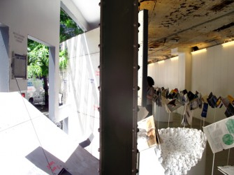
Andrew Forster: Yesterday I went to the Storefront for Art & Architecture. In the back there is a set of books that you picked out. Is that a recent thing?
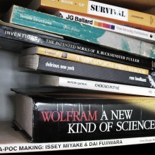
Vito Acconci: No it was before the current director was there, before her was a person named Joseph Grima (who is now actually the editor of Domus magazine). I don’t remember how it started for him, but he asked a few people to give him a book list and the book list would turn into a little book store, at Storefront. I don’t know If I remember all the things I put on. I know I probably put, because this is a very important book for me, a book … a book that I know I got … I got a lot of books in the late 60’s, in the mid to late 60’s, from getting clues from the Whole Earth Catalogue.
AF: A survival guide.
VA: Yes That’s exactly the one I’m talking about. This kind of ‘how to survive’ book which has chapters on different challenges…
 [click any image for caption and gallery]
AF: Loneliness, cold, etc…
VA: Yeah, which is great, beautiful chapters; too lonely, too hot, too cold… But it’s serious in a strange way… but it doesn’t leave out humour, but at the same time, and I think that’s a real keynote for me. I think comedy is more important than so-called tragedy. I think comedy gives you… I think when you laugh it probably means you’ve had a second thought, you’ve reconsidered something, and I think that is kind of my goal. I don’t know if it always was but… But yeah… even… I thought pieces I did in the late 60’s, I thought the performance pieces where funnier than other people did.
AF: There is a sense that your work since the 90’s, the architecture work, the public space work, that it is getting beyond a sense of transgression that comes out of visual and performance art… That is no longer a singular persona of an artist as shit-disturber, under-miner of all things, but that there is a different mode which is a mode that somehow relates to making demanding gestures in the area of design…
VA: It probably is. It’s different. If I can say what I want our architecture to do (and probably it does, or it tries to do more than one thing). But what I hate about architecture (and I love architecture!) is that it forces you to do things and my goal (and we certainly don’t know how to do it) is something else.
What started in the 80’s was when I talk about stuff I used to say ‘I’ and then I had to start saying ‘we’ because it’s a group of people working together, and the group changes. The group has changed over the years but ‘we’ became important because I thought when I thought I was doing architecture I started to think I have to work with other people, because I don’t think architecture can come from a single viewpoint. It has to come from a group of people thinking together, talking together and especially arguing together. I think this condition is important. I want architecture to have loose ends, because if it doesn’t I don’t know why anyone else would want to be there.
The big problem with architecture is it determines your moves you know you go through a door, sometimes you want it a few feet bigger. And there are ways to do a changeable architecture, but it usually… and we’ve done it, Storefront is somewhat that way, where it has hinging parts, but that is not real freedom, that’s like supermarket freedom… you can do everything you want as long as your supermarket carries it…
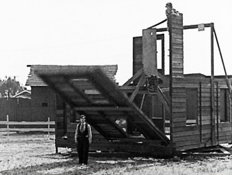
AF: You say there is a sense of humour in Storefront for Art & Architecture [designed in collaboration with architect Steven Holl, 1992-3]. When I first looked at pictures of it, I thought of the Buster Keaton movie where he is building the house [One Week, 1920].
VA: Buster Keaton is a very important, Samuel Beckett and Buster Keaton are almost the same thing. You probably saw the movie Samuel Beckett made with Buster Keaton [Film, 1964]…
AF: Yes, yes. In One Week Keaton builds a pre-fab house without instructions, but mis-builds it. Its completely wrong… you open up a door and its got the sink attached to it, now on the outside of the house. Things like that. Gags based on displacement and physical discomfort. There is something like that about Storefront for Art & Architecture, it’s like a door in a small room, that you open the door but that makes the room too small to get your body around the door, not at all making the space more efficient but creating an opening by a kind of inefficiency.
VA: It makes an opening, and it probably, and it possibly provides walls, perpendicular to the existing ones. But it provides a change, but I don’t know how much it’s used. I think it’s used more now than it was for a while with the new, relatively new, director [Eva Franch].
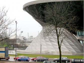
AF: You said that the visual or the image is a problem in architecture, that magazines create a problem in that they freeze time with images of buildings and space. I had an experience when I went to BMW World in Munich [Coop Himmelb(l)au] with its twisty façade.
VA: Yeah, I’ve seen it in pictures.
AF: What it made me think about, or fear, is this thing that in a lot of architecture that is made on the screen is that it’s all facade, so there is this thing this twisty thing it’s this extraordinary image you see as if it is a photograph but inside it is conventionally built. The façade or image is the experience.
VA: Yes, but it doesn’t have to be, the outside can shape the inside and vice versa. I mean I admit we have gotten involved with the twisty things too… It’s hard not to, working with the computer. But just quickly, the thing about twisty things, is I think what fascinates a lot of people using it, is the continuity of it, it’s topology. And it’s that you can go from inside to outside and back again. We got obsessed with things like the Klein bottle…
AF: For sure, but here is the thing about visual. Its that there is a certain kind of architecture that is very visual in a specific sense, that is exclusively about what it could be as an image. And it makes me think about pornography, actually. That it is pornography. That we look at a building and we have a fantasy about how we can live like this, but it’s not about something that ‘is’, as when you talk about Jasper John’s text painting as ‘fact’. This is not ‘fact’ or substantial in that sense, it’s like this… hmm, it’s hard to put it in words… but there a sense that it’s connection to stuff is just image, purely for the eye.
VA: Yeah, yeah.
Even though its built for the world, in space. Its…
VA: …just image. Just image is hard for me I want image to be useful, you know, I want image to be, you know, can you be in the middle of image — then it’s not image anymore, because it’s not. It’s not in front of your eyes, it’s, you know… and maybe if I try to deny it, the notion of, the notion that a bodily experience of something is important to me, yet at the same time now I keep thinking I am not against virtual experiences either. There might have to be a mix, maybe some of the kinds of things we really want to do can only be done virtually. But I always think, virtual: virtual is an anticipation of the future, you can’t do it now, but if we do it virtually, people will start to think well why can’t we do it? And maybe eventually you can. I mean I won’t be alive, I don’t think, but, I think the architecture of the future will probably be movable.
That every time people are so against something, it’s a clue that this something isn’t going to exist anymore, so all over the world people are terrified of immigrants, probably means that at some point there aren’t going to be national boundaries, there aren’t going to be immigrants, people can go anywhere…
AF: Do you find design students are different from art students?
VA: Yes.
AF: You give an art student a project, it’s about some kind of expression? You give a design student the same project and maybe they’re not in the problem in the same way, it’s a problem that other people are having, for better or worse…
VA: Yeah, though there are some architecture students who get obsessed with this [expression] problem, these kinds of problems. A big difference, I don’t know if this comes from training in schools, but if you ask an architecture student, why did you do this? They try to say why. Whereas art students, they say gee, I don’t know. And even when I ask things… I admit, art students exasperate me. I say, why did you put it horizontally rather than vertical? They say, I don’t know. I say, you have to know. Why did you make it that size? It’s interesting… ‘they come that size’. They almost don’t like to give reasons, reasons ruin it. Reasons were always important to me. I mean certainly when I was doing art, I wouldn’t have done it without reasons. I mean, I know why I was doing the work I was doing in the beginning…
AF: Contemporary art can ask questions down to the grounds of thinking and doing. Design builds to any program. There is a resistance to seeing these two modes of thinking collide. Design doesn’t do failure and art deliberately problematizes notions of usability. Perhaps that contradiction is useful. Can design be critical in its practice or its production in the real world, in a way that art, confined to a hermetic system, cannot? Art lives over here in the museum, we can ask of art questions in a kind of ‘it is as if’ way… And design? What can it do?
VA: The fact that you said, and this is true, art is in the world of gallery and museum, but it’s kind of an enclosed world, maybe it can touch on other things. One reason why I started to do what I thought of was architecture in the mid ’70s, when I was doing installations in galleries or museums, I started to think I think I‘m in the wrong field, I don’t want to do these projects, where only people, who are for whatever reasons for some reason or other are only involved in some kind of art world. I want do something where somebody goes into or stops in, not because it’s art, but because for some reason or other they’re intrigued by this, or maybe they hate it. I don’t want them to go because it’s art. I want them to go because somehow or another, I, the person in the street, have walked down the street, and I say, ‘what’s this?’ And I turn and go… that’s kind of ideal for me. I don’t like the idea of… I wish things would never be labelled exactly.
You probably know that most of our projects aren’t built. I mean, is that purposeful? It’s not that we don’t want things to be built, but we don’t just want to build anything. And it’s probably important. When I think of, I came to architecture kind of late, and certainly in the early 70s, I was thinking God, I can’t stand architecture, I can’t stand these city buildings, etc… Somewhere there was a change. But I think the change was that I realized, I’m not so interested in space, I’m interested in people in space. That’s a big difference. But when I think, who are the architects through the years who probably meant something to me. In the 18th century, Boulez and Piranesi, and in the 1960s, Archigram… probably not one built project there, but a lot of ideas!
I thought you could do design, it could thicken the plot. And that, you know, is as a maze useful? …I think it is. You can certainly get to a destination quicker without a maze, but there might be things along the way that you wouldn’t get if the maze wasn’t there.
AF: I’m trying to pinpoint what this idea of criticality is, that is so limited when it’s carried out in the art world. Yet it’s also compromised when it’s carried out in the world of architecture and design, but at least it’s in collision with something. It’s implicated. Do you have experiences doing design projects, when the resistance is too much?
VA: [that…] we probably aren’t going to put it up, because people won’t let us put it up. But I admit, we’ve done things for… a proposal we did for a competition, maybe 2005-6, a competition for a library in Guadalajara in Mexico. It was an open competition. We certainly weren’t chosen, even as a finalist. But we were very struck by the site. Because right next to where this library was, there was going to be… there was a large street, almost like a kind of small highway. So we proposed, we’d start the library by stepping down, into the ground, making a kind of maybe a courtyard. Once we get down, we start step up, to make the library. But as we start to step, we can’t resist that street. So we go over the street, into the rest of the city. Then we thought, oh, why don’t we use this as a kind of expansion system for the building.
Did we seriously believe that anyone would accept that? No. But it gave us a chance to think. I think design is much more about… to anticipate the future. That’s more important to me, it’s certainly more important to me than if someone says yes you can build this, but you can’t do this part. Well, don’t just do parts. Where you say, oh there’s seven parts, let’s do three. I’d rather get something refused. Again, I think of Piranesi, I think of Boulez, I think of the 60’s Archigram.
The thing about Archigram that I like is that they make things look so specific that you say, of course they could be built. Some of them might not have. But specificity is important. I have blocks against certain things. The Situationist, Constant. Not that I don’t look at them, but, for me that stuff is so flimsy, so vague, compared to Archigram, where I can see this down the street. This isn’t in somebody’s mind. I don’t mean it’s not that I don’t take them seriously. At the same time, it’s that I don’t get it, just like I don’t get Superstudio. It’s too abstracted to me. It’s almost as though they’re pulling one over you.
AF: Is it because it’s not grounded in a potential tangible experience?
VA: It is, certainly, and again, it has some of it has the clarity of Archigram, but in a different direction. This is making concrete a kind of abstract thought. I don’t know, sometimes I go woozy with abstract thoughts. I mean I love abstract ideas. I hate abstract words. Abstract words just contain too much. I want to get specifically, and maybe in a lot of different directions, to an abstract idea.
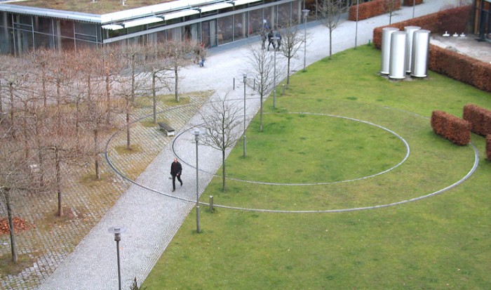
AF: The Munich piece, Courtyard in the Wind. For me it’s interesting because it’s still an ‘art in architecture’ piece.
VA: The problem is most of the projects we get to do are so-called public art projects. We’ve very rarely done architecture projects. Mur Island was probably the closest.
AF: Certain artists specialize in ‘art in architecture’ projects and some get very good at producing them in a way that they fit in. The system of generating art in architecture is a one-percent scheme with the criteria that something has to last for so many years, etc. – it has to ‘behave’ properly. There’s always this push and pull, of wanting to do something interesting, experientially or otherwise, and doing something that isn’t going to cause problems.
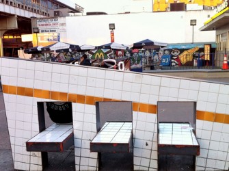
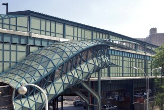
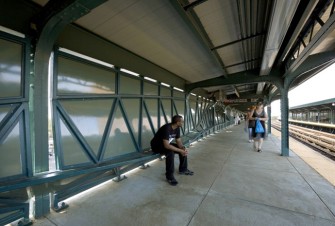
VA: I admit sometimes, I can’t say we’ve gotten away with something… it’s no secret. Sometimes. Like the subway projects, no other subway project is like this, and I don’t know how we were able to do it. One is Coney Island, and one is 161st Street… where we took the subway tile, and raised it up through the ground, so that it becomes a bench made of subway material right in front of McDonald’s. The seating is made by taking subway tile and sliding it down and forming seats. Do people notice that? They probably just say it’s a place to sit down. Maybe one person every now and then does a double-take.
AF: Back to Courtyard: what do you hope someone’s experience is walking through this work. What I saw is that the city workers in those civic buildings come and go through the piece to the station.
VA: The way I saw it, you’re opposite, you’re inside the building, you look out, you see there’s a tree there. Now you look out again, and you realize oh the tree’s over there. Or I stand opposite to you, I blow my nose and now you’re somewhere else. In some ways, more than some of our other projects, it doesn’t particularly have a use, except to lead to a kind of double take. Where you thought landscapes were supposed to be still. Now it’s moving. I mean, it’s a piece I like. But compared to what it can do for people, I think it can make people laugh. I’m not sure it can do much more.
I know the way we started it, the site we were given was this courtyard, and the building department that was going to be renovated, it was clear there was a tall tower in the corner. And we thought that tower is so striking. So we go, the way we thought of it, let’s deal with the highs and the lows of the space. Let’s put something high in the tower, let’s put something low in the courtyard, and one should affect the other. In this case, it’s a one-way direction. Once the wind turbine is moved by the wind, it stores electricity. Therefore down below, this horizontal moves because of what’s happening with this vertical.
AF: What’s the other thing Courtyard ought to do, or could do?
VA: I remember one thing we did, when we started thinking about the piece. At first we thought, we should make this whole courtyard move. But we couldn’t do that. But even that would have just been a way to take something that’s ‘normal’ and in some way turn it upside down a bit or turn it inside-out a little bit. But I don’t know what we could have done that could have made it more useful. Because I like the idea… let’s give something a use, let’s make it have a use. More of a use that wouldn’t have been there unless we had done something.
AF: Courtyard does do a very nice thing in terms of the language of landscape architecture in that any urban park is built on top of a serious amount of city infrastructure. It’s drainage, it’s electricity, it’s mechanics. There isn’t earth down to the earth. It points at the contrivance of those spaces, that they are human-made spaces.
VA: They are. They didn’t happen by themselves. They are designed spaces. Maybe not particularly good design. But designed. If something’s here, and then you put it there, it’s the beginning of design.
AF: An architect or designer exists on the cusp where something particular, or singular, can still happen before something becomes fixed, the last moment before something becomes part of the technologized world.
VA: You don’t think technology can help invention? I think it really can. I think you use the means of the time. I never would have been interested in a so-called virtual space a few years ago. But once I realize those possibilities are there, I start to think, can there be a mix.
We’re doing this project now, it’s being built, a project in Indianapolis [Swarm Street]. It’s a tunnel, a kind of tunnel to a building, it goes through a parking lot. So, what we did was, on the sidewalk, there’s a place to walk, and there’s also a bicycle path. As you walk through, as you cycle through… you activate motion sensors that are above you. There’s a steel structure above you, the steel structure holds literally thousands of LED lights, embedded in the sidewalk, there are probably an equal number of LED lights. So when you walk through, as you activate a motion sensor, you turn on these LED lights below you and above you. So as you walk you turn on, turn on lights. So it’s like a swarm of fireflies that’s flocking around you. Now, if you’re coming from another direction, or if you’re coming next to me, and you start to pass me, now your lights and my lights start to swarm together.
At least there’s this somewhat beginning effort, that, you know, people aren’t doing this purposefully, but as they’re walking they’re activating something. And then, once they realize it, maybe they can start to do it on purpose, or do it with someone else. It’s important for us to do stuff that maybe wasn’t so easy to do at another time. I’m starting to think, I don’t really want to make surfaces. I want to make pixels, I want to make points, I want to make dots. I want to do thick air. So that the thick air becomes buildings to be in, at least temporarily. Of course, I don’t have the slightest idea how.
AF: In an interview you said public art is de-design.
VA: Have we lived up to that? I hope we have. But I wonder sometimes. I wonder sometimes if I’m afraid, do we make concessions without admitting it, because we do want things to happen?
AF: Compromise comes out of wanting to be implicated, in order to be implicated, one makes compromises. One says, how do I fold it differently?
VA: I wonder if I even recognize the compromises sometimes. I hope I do. I think most of the things we propose… For example, the two subway stations – there were no other subway stations that had stuff like that. And I don’t know why, exactly. I think the only reason we were allowed to do it, is that they do provide things for people. Like places to sit, like the west 8th street station. One of the most important things, they said… was, or one of the most important things to them, was that people have to be able to see Coney Island, see the amusement park, see the beach from the subway station. So the one of the first things we thought of was how to we make views. We have a tendency, I try to talk to whoever is in studio at the time, was let’s not start by thinking of windows and doors, let’s start by thinking of openings. If all you need to do or want to do is look, then let’s take a solid, let’s take a surface, let’s split it, but we don’t have to split it that far. We can split it only enough so as you can see out. If you want a door, maybe you want a door later, let’s tear it out. If you had a door there, we would have walk out into space.
AF: Do you go back to that subway station and watch how it’s lived in?
VA: I’ve been there at around 3 o’clock in the afternoon, and there must be a some schools nearby. Because there are a lot of kids there. And they’re sitting. Are they necessarily looking at Coney Island? I’m not sure. Because they’re passing by. The seats are more occupied. Does anybody even notice that they’re different than other seats? That I can never know. If you go with somebody, I think the wrong way to find out what people are thinking is to go is to go up to somebody, and say what do you think?
But we made a bigger mistake. We knew at one point (we didn’t know at the beginning) but we knew as we were designing it, I don’t remember at what stage, we knew that they were only going to do it only one side of the station, the side that faced Coney Island, and not on the other side of the station, which is the side that faced the neighbourhood people. And I don’t think I can ever forgive myself.
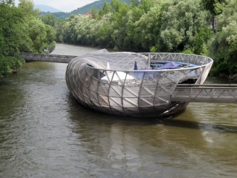
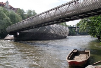
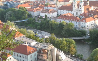
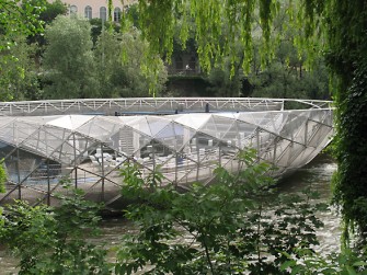
AF: I’m kind of intrigued by the idea of second thoughts. Lets talk about Graz… Mur Island. You asked a while ago, about Courtyard, does it do enough? So we’re in Graz, and this island in the river does become a public place. It’s very active, they’ve kept it longer than they planned…
VA: Much, much longer time than it was supposed to be just for…. They probably thought it was going to be much more than the year, that Graz was the European Cultural Capital. They probably thought two years, three years… People seemed to use it. It got screwed up a little bit. In that, I don’t know if after the first year or two, if it was ever used as an amphitheatre.
AF: They did not seem to have programming for it?
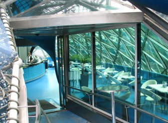
VA: No programming for it. It was, for the piece to be done, there was an organization called Graz 2003. Graz 2003 maybe came into existence in 2001, and went out of existence in 2004. So since then there was nobody, supposedly, who owned the island. That wasn’t exactly true, because the cafe and bar was being rented by somebody from the city. But the city wasn’t really taking care of it. Instead of being used as an amphitheatre, the amphitheatre was starting to be used as an outdoor cafe for the restaurant.
You know, it’s what, nine years later now, people in Graz seemed to have gotten kind of involved it in, so that they started this movement that it needs some renovation. And then the city thought, I’m not sure, (it’s amazing how you hear two sides of every story). The city said we need to have theatre events, theatre events during the fall and winter. So we need some kind of canopy for the amphitheatre. Then we heard another version that the person who rents the cafe, thought he would get many more customers, I think I believe that story.
AF: Do you feel that you can exert rights?
VA: You can’t as a designer. It’s very different… but I did get a letter, not from somebody who was responsible for it now, but from somebody who was involved when the project began, and they said, you know, they want to put this roof over it. And he said that doesn’t seem right. And he was right, because the whole thing was about, was based on, here’s a bowl, now there’s a dome. But I can understand, to make the thing more useful, but then I wrote to them to say look, you don’t have to do what we’re suggesting. But give us a few weeks to come up with some solutions. And we did, and I don’t know if they’re going to be followed. But there were things that…there was a roof, that was sort of like these clouds, it would be away from the island, but then on lines of cable could pass over it, and it could be a retractable roof, they say now that they’re going to consider what we’re saying. But that is the thing about design.
AF: What do you think the island does in the city? What it does is significant and ongoing.
VA: Most of it is hearsay for me. I think that I did go back within the first year, and at that time it was really bustling. But I’m sure it’s not bustling anymore. I’m sure the cafe is used more than anything else. I did see some stuff from Graz newspapers was translated for me, where it seemed like people were saying we need to keep the Mur Island going. I did talk to some people. I was very struck when it was first built, and this was even before the cafe part of it was built, people took walks on the island. And I was very struck that especially older people… I always think we lose older people, maybe some younger people become fans of us, I don’t know if older people… but older people seem to enjoy it. I felt that in some way, I don’t know if public space is something that you have to ‘get’. But when they were in the bowl part, and they walked, and suddenly, they looked up, and there was this dome around them, they started to laugh.
And what I said before, that laughing proves you may have a second thought. It seemed that maybe they didn’t exactly get what I got, but something. It seemed like they felt some kind of change. When it was first built, a local pastry shop made a little pastry called the ‘Acconci island’. It was this little twist, you know. So it did seem, you know, and I wanted to, you know, I don’t expect, you know, some every day person who possibly was, you know, but was 70 or 80 years old at the time, laughed, I don’t expect that person to say oh, this is a bowl that twists to become a dome… but they recognize something. That they felt at least some kind of change.
AF: The grid of Graz is very uniform. Your passage is across the grid, a diagonal shortcut. Mur Island creates an angle across the urban grid.
VA: And this was something that I started to insist on, but they wouldn’t let us do. Now it’s too near to an already existing bridge, and I thought, what we proposed first, let’s make it where there’s no bridge. I thought that if we did that, then the land on either side of this new bridge… it might fit into what you want, it might be more developable or something. So I don’t like the idea that we gave in. I can’t stand that later I realize I didn’t fight.
AF: I have a question about aesthetics. Mur Island has a particular aesthetic but looking at your work in general, I think the aesthetic is not the concern.
VA: It comes from something else.
AF: Maybe someone in the office had this knack, or this skill. I look at the models. Today it’s plasticine, tomorrow it’s a nice 3-D rendering. Is the issue really what it does rather than what it looks like?
VA: That is true. I wanted to, and when I say I wanted to have some kind of function, I don’t just mean you could walk where you couldn’t walk before, but I hope it has a function of something that can be transformed into something else, I would rather now do stuff that that people can change. I don’t think we’ve done that enough yet. The Indianopolis thing [Swarm Street] is a very small inroad towards that. But I want people to take architecture in their own hands. I don’t want people to be subservient to architecture, I hope people can shape architecture. I want people to shape architecture.
AF: The questions we were talking about earlier, about the visual aspect, these are things that get in the way of what it does, ultimately?
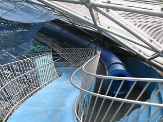
VA: I hope it doesn’t. I hope the look, I mean I hope, the way this project (Mur Island) started was let’s make a theatre. I wanted one thing to turn into another. Doesn’t exactly turned into another, you have to take this walk, but I wanted everything to come from a bowl. Turn the bowl over, it’s a dome. If one thing was on one side, and one thing was on another, there’s a twist in the middle, that’s the playground. So it started with that… it didn’t exactly start with that. The way we started, thinking we’re doing something on the water, they’re asking us to do what they called a person-made island. At first I thought it shouldn’t have bridges. It should have an underground passage so that this is an island. We couldn’t do the underground bridges, because I didn’t realize how shallow the water was.
I mean sometimes we do start at a wrong direction. I love the idea of an island of water. And I don’t know what to do with it, an island of water. We tried, can we make an island based on a whirl pool? Can we, now I don’t remember what other kinds of water things we did. But it was getting us nowhere. We only got somewhere when we started to think of conventions. When we started to think of what they asked us to do. A theatre, a cafe and a playground. So therefore, it was easy to start with the theatre, because that’s a very conventional shape. Some kind of bowl, bowl becomes dome, in between becomes playground.
AF: That relates to a question I have about architectural processes. Architects always talk about responding to a ‘program’.
VA: What interests us in responding to a program, is that the program usually involves something that people are going to use. So the idea, we do think of a peopled space, so that we can take hints from the program, we like to double the program, or multiply the program, we like it not to have just a single program.
AF: Earlier we were talking about your interest in Jasper Johns, about language as fact. The program is language, isn’t it? Can you play with the program? The program is about trying to fix some set of conditions. The experience that I have is architects often see language as part of the selling of the project, and not part of the source. Whereas your work takes the program and says where can this go, where can we shift it, or unfix it.
VA: Right, now we’re about to start working on and it’s admittedly a public art project. There’s a kind of hollow in a building, and they want this hollow in a building, people can kind of enter this hollow part and they want it to be a place for a time piece. And that seemed general enough for us. But we’re thinking, we don’t know how to do this. I would love us to ask: how can we make this space filled with dots, filled with thick air, and how can that thick air start to fill time? I have no idea, no idea, how. So yes, you could do thick air virtually, but this has to be something where you’re walking through time. You’re walking in the middle of time, you know. Time was like tiny flies, you know.
AF: These are the kind of sources that are in language, that are in the imagination.
VA: Very much.
AF: It’s not material, like ‘we’ll build this one out of aluminum…’
VA: It’s never that.
AF: Does that confound your colleagues?
VA: They’re all architects, none of them are registered architects yet. But that’s a big difference with people ten years ago and now. Then a lot of people who worked for us didn’t care about becoming registered architects. Now, everyone wants to become a registered architect. Also a change of money time, from a lack of money time, I think. There’s an open competition for a place called Freshkills in Staten Island, a former garbage dump. They want to turn it into a park. We’re definitely going to enter that. That deadline is coming closer and closer in July. We’ve worked, at least theoretically, in garbage dumps before. One in Israel [Hiriya], and one in Holland [Breda]. But they both were theoretical projects.
AF: One was a floating?
VA: I liked that. But here, at least in the beginning, the thing about a garbage dump, is that it really does eventually change. Because it releases methane gas, etc… so we want to put something like a Fuller dome, not quite that, so that you’re on this almost like you’re based on a structural system that has a lot of different kinds of pathways, maybe you could eventually go down through part of the original dump. We don’t want to plant something. We want some in-between place. Between this earth that’s covering the garbage dump, and I know we can’t be walking on air, but instead of having trees, or stuff like anything that a park would have, can there be almost be a tree pocket?
AF: A burrowing down through the layers of the dump?
VA: No, it’s almost like having some things above the dump, but very island-like. Above and then maybe something below. Projects do come from, and I can’t say no other firms work this way. (Are we a firm? I don’t know. Can you be a non-money making firm?) I might start a project off with words, with a general idea. But then we talk a lot. We talk a lot. So it probably doesn’t necessarily lose that beginning point. There are, I’m sure there have been some projects that go in another direction once we start to talk. But at least if it does keep that general beginning idea, it changes a lot with the different people talking. That’s why I bring up the, I think collisions are just as important as collaboration. More important. You get to a new idea. You get to a new idea that none of us would have thought about, individually.
AF: Do you think a project that is sitting on a garbage dump has more potential for collision than things that are, like Mur Island, a pavilion, framed in an ‘arts and culture’ context. Even Storefront has such a pavilion aspect to it.
VA: Yeah. The strange thing about this Freshkills competition, is that something’s already been done for Freshkills. It’s very, very basic. A landscape architect did it. But what they calling this stage now…but that was just a kind of rehabilitation project. And now they’re calling this project, strangely, an art project. I’m not sure why. So they’re saying, you know, it’s open to architects, designers, and I’m not sure why.
AF: If its an art project you’re not messing with the systems in some ways.
VA: Maybe you’re right, maybe they’re thinking now this is the entertainment part. Because in the ones in the past, and at least until a while ago, both of the Breda project in Holland and the Hiriya garbage dump, which is somewhere between Tel Aviv and Jerusalem, we tried to find ways to use the methane gas, I don’t know if we have that occasion here.
AF: Sustainability is one area where there’s an opening for a kind of criticality… to insert something that’s more difficult than a conventional approach. Talking about a project in the garbage dump, it’s not about making anything useful, it’s about some other way of thinking through, which isn’t just the proper materials, proper approach, proper systems.
VA: Yeah. I mean the people who tend to work at the studio are the people I say yes to, tend to be people who are more on the side of, ‘let’s at least start far-fetched’, and see what we can do with it. We have had the opposite, and it has been hard. And almost every time we have hired a registered architect, it’s been so much the opposite. It’s like now come on, we have to start a project, by realizing okay this is how much money we’re getting for the project, therefore we can only spend this and this many hours, and I realize, I can’t think like that. I really don’t want to. I just, I get so blocked from the beginning, that I say, we’re never really going to make money on architecture.
AF: I think in the case of your work, you go where the thinking takes you. Whether it’s being a writer, strictly speaking a performance artist, public works, or participatory installations. The thing that strikes me is there is a consistency of purpose, people say he was the guy who did this, now he does this, then he does that, and that doesn’t make sense. I look and you’re work, it is there and then it is here. It makes perfect sense.
VA: I hope it does. Yes. I mean I did want, I’ve felt, I’ve always felt that I’m committed to such… I don’t know if I ever want to say I believe, but that I’m committed in such and such a thing. But then times change, and maybe I need to reconsider.
AF: And the opening for ‘critical’ may now be somewhere else?
VA: I hope you can be critical in any field you’re in. That you can be in the field, but criticize it at the same time. So that that may make you change, or it may make the field eventually change.
AF: Do you think that the field of architecture, the field of design, that you’re working up against… calls for an ‘unfixing’ (when I’m writing about your work I’m using the term ‘unfixing’).
VA: I like that term.
AF: In the sense that there’s a process in contemporary culture. The process is about fixing. Unfixing is to loosen. You say, I don’t know if this or that project worked. Well it’s because the process is always going to tighten it up again as soon as you let it go.
VA: Well we hope we have some control over something that can’t be tightened up. I have done things that I have realized I should have thought more, so that I did object to some of the things. The worst thing I think that happens where we’re working on a project, is that somebody says oh, this reminds me of such and such a project, referring to something we did. So I say, let’s try to change it. Which might not be the best attitude in the world. There’s nothing wrong with doing, maybe a second version of something that you did a year ago, might lead to yes, maybe it’s a second version, but it leads to some new possibilities. Sometimes I wonder if I do have too short of an attention span.
AF: In your work, there’s an interest in the relationship of the body to space, or body to space and time, as unfixed. Which is fundamentally different from master works of architecture and design, where visuality and monumentality, is the primary experience.
VA: Monumentality is a pet hate for me.
AF: So if we are interested in how technology fixes time and space, and our relation to it, we can see with your work a desire to fish out all that is unfixed, all the unfixed moments, as the moments and dynamic in which there is the most at play and the most to be revealed.
VA: Yeah, again, technologies change. Technologies lead to other technologies.
AF: …then lets say the dynamic of the built world, as opposed to the dynamic of bodies in space and time. You seem to always return us to that space where the latter is the primary experience.
VA: Loosening up is much more…in some ways I wish we had the chance, we could demand it… That every few years, we could go to a built project and add something, take something away, change it. That’s why the notion of…I know what, I don’t know if I can say ‘we’ here, but I know that I, the most important thing to me is something that is always changing, once people are using it, and I really don’t know how to do that yet. I want people to be influenced by the space we make and that they’re in, but now that they’re influenced by it, can they also change it? So that maybe, it starts to go away from us.
Maybe we can do that. Maybe we can do that in the garbage dump. And again, I was so struck, when we did those two theoretical garbage dump projects in 1999, the fact that the presence of methane gas really is making this ground move. Maybe you don’t see it in front of you, but…
AF: You also seem to try to not making things user-friendly. User-friendly is a term that come out of a problematic efficiency paradigm.
VA: It’s almost, can I make them intriguing puzzles? I would love a space, and again, the only way I think about a space, in the middle of time, that can this be something that a person might want to… rather, it’s not that I don’t want people to use it, but I hope they can use it in a way that they think ‘maybe I can do something to it’. At the same time that it’s letting me do something. I don’t want people to be forced by something, but I want it to be a junction of person and place and time. We haven’t reached that, but a lot of people are thinking that way. But these are architects who don’t think about building much.
AF: It’s an intriguing possibility.
VA: It’s almost like, can a project we do be a field for action for other people? But they’re not just living off…it’s not a sport that has definitive rules. But even a sport can be done in different ways.
AF: I think, as you talk about Courtyard in the Wind, for instance: It is the attempt to create that space where there is that kind of multiplicity… But maybe a last question is to touch on, you said, ‘I hate monumentality’. To me it has a connection to our discussion about the visual as a domineering thing…
VA: To me, monumentality is a particular kind of visual, in that you’re smaller than the stuff. So it’s there to overwhelm you. Something can be big, but maybe broken, so that you can be between it. I guess I think that this is what public space is. It used to be that you had to bow down. Or, even churches are monumental. It’s about God. I always remember, when I first started doing public stuff, you have to take the monument and break it down. You have to take the monument and bring it down, so now people can take a monument which by its nature is probably vertical, make it horizontal, and make people walk all over it. Or use it, turn it into a kind of hill town. So now you can inhabit it. It has to be subjected to people in part. So I did start thinking of that relatively early.
AF: It seems to be an opening between landscape architecture and building architecture.
VA: I think buildings should melt into landscapes, and landscape can maybe develop into something like buildings. The nice thing about a building as landscape is that you walk through a forest. You walk in between trees. You’re not kept at… the traditional notion of monument is the thing nobody pays any kind of attention to, the guy on a horse on a pedestal, the pedestal is already bigger than the person is. And I did start thinking of public space and of architecture as, let’s walk into, through, across the monument. Let’s bring the monument back to the ground we’re standing on. Once it’s in the ground, old monuments do get covered with greenery. That’s what nature does, it takes it back.
Recorded at Acconci Studio, Brooklyn, NY: June 2nd, 2012
© 2012 – Vito Acconci, Andrew Forster
