While commercial appropriations are taken for granted in fashion and design, the field of visual art has always maintained at least a pretext of critical distance, if only in the guise of artistic freedom. Critical distance, in a contemporary context, is a matter of thinking critically about the convoluted culture that both artists and designers are currently implicated in, of harnessing the conceptual possibilities of creative practice without directing it toward a commercial outcome.
Takashi Murakami’s artwork throws open this critical door and launches straight into the heart of commerce. His work is cute, seductive, exceptionally marketable and consumable, wide-ranging and successful both critically and commercially. He has become a formidable capitalist and a formidable influence in the art world, most particularly in the context of contemporary Japanese art. How can such an overt surrender to the systems of capital have been so well embraced by the art world, and what are the effects on critical artistic practice?
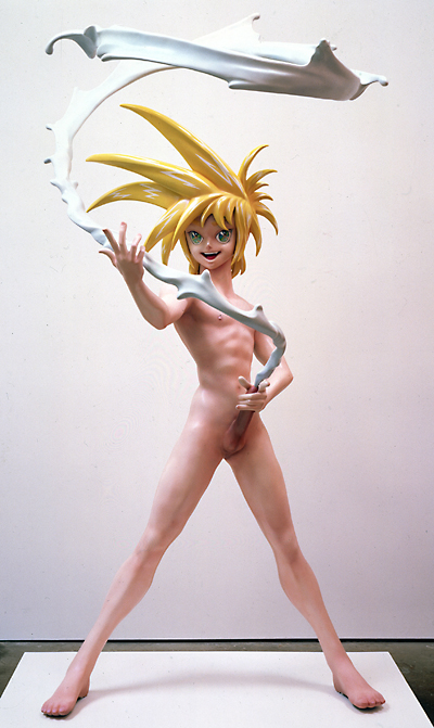
Among Murakami’s most celebrated works is the sculpture My Lonesome Cowboy (1998), a life-size depiction of a naked boy, proudly spouting a stream of white semen that circles around him in the style of a lasso. The work is an appropriation from the popular genre of erotic manga, otaku, transformed into an art object through the title’s reference to Andy Warhol’s 1968 film Lonesome Cowboys. With bright plastic blue hair and cartoon features, it is cute and colourful enough to appeal to a general audience at the same time as carrying off a semblance of social critique through its exaggerated sexuality and references to 1960s Pop art. Yet to what extent does My Lonesome Cowboy simply reproduce a popular fetish, thereby reinforcing the socio-economic conditioning of consumer desire, as opposed to providing insight or critique?
The design of the figure was modeled after a similar character in otaku animation, and in order to be as faithful to the genre as possible, Murakami employed commercial manufacturers to produce the piece. There is no sign that Murakami was attempting to challenge or modify the otaku stereotype, with its abstraction of human desire and affirmation of sexual fantasy according to social constructs. The trail of semen that encircles My Lonesome Cowboy is the most obvious example of this fetishism – the human bodily fluid is stylised and converted into a static, plastic model of imaginary dimensions. Human experience is thus transformed into an object that emits other-worldly qualities, with a dollar price to match. It becomes a commodity that fuels the drive to consume unnecessary goods. In Marx’s terms, we are talking about commodity fetishism. The commodity is not produced to satisfy primal needs or desires, but to enhance an unnecessary cycle of production and consumption, abstracted from human necessity. The single feature of the work that might remind us of human desire and bodily experience is brandished, cowboy-style, as a plastic weapon.
[click any image for caption and gallery]
Murukami’s celebration of the reified commodity is even more evident in the design for Hiropon (1997), the female counterpart to My Lonesome Cowboy. Hiropon’s adolescent body is precariously balanced on one pointed foot, her tiny frame completely dwarfed by two bulbous breasts that explode from a tiny bikini. Only her elaborate blue hair competes with the presence of the breasts, from which milk spouts. The milk forms a complete circle around her, doubling as a skipping rope. Like My Lonesome Cowboy, Hiropon was not created as a critique of the way women are represented in otaku culture. Instead, it directly appeals to the market. Murakami admits, “Because making a life-size figure is really no different than making a sex doll (a dutch wife) in the context of the anime figure, it’s safe to say it ours was a fairly shameless plan from the start.” [1]
This desire to conform to, rather than challenge, the otaku market was made even more transparent when Murakami decided to remodel Hiropon as a new character, Miss Ko2, to be more in line with the sexual fetishism of the popular genre. Indeed, when Murakami approached a leading contemporary otaku designer about using one of his computer-game characters as the model for Miss Ko2, Murakami received a skeptical response. The designer, who is known simply as ‘Bome,’ replied, “This game is an utterly artless pandering to stereotypical otaku fetishism. Nor is it original – rather it was created with a complete understanding of the tastes of the entire otaku market for uniform fetishism.” To which Murakami said, “That’s what I want.” [2] The problems associated with this critical ambivalence become more apparent in the context of Murakami’s subsequent forays into overt commercial production.
Murakami’s status in the contemporary art market escalated in 2003 when he collaborated with Marc Jacobs on a range of designer handbags for elite fashion brand Luis Vuitton. Working with his own iconography, he created two monograms – one based on round, colourful flowers animated with smiling faces, the other featuring floating eye motifs taken from his anime characters. While clearly maintaining links to his visual art practice and its pretext of criticality, all traces of content, including the subtext of cultural critique, was evacuated from the resulting design. The thoroughly friendly pattern served simply to highlight and ornament the traditional Luis Vuitton monogram, ‘LV’, which remained within the pattern, transformed from brown and gold into Murakami’s more colourful primary palette. Of course, there is nothing illogical about this kind of decorative design emerging in the context of fashion. When simultaneously embraced by the art world, however, the issue of the artwork’s ‘design’ becomes more complex. In this case, Murakami’s aesthetic was a vehicle for commercial advertising both inside and outside of the gallery. The effect was obvious and at the same time insidious. Some critics compare his work to Warhol, implying a critical tension between the idea of high art and popular culture.
Murakami’s work differs from Warhol in an important aspect; it lacks critical tension. Art retains no space from consumerism to provide contrast or juxtaposition. Where Warhol filled the gallery with replicas of existing consumer imagery, in the form of Brillo boxes for example, Murakami paints without referent his own branding. Murakami is the Brillo manufacturer. His trademark character, ‘DOB’ is one such product. A large, round, panda face with big friendly eyes rests on a petite mouse-like body, resulting in a cute combination of Astro-boy, and – in true Warholian style – Mickey Mouse. Where Warhol displayed the existing consumer fetishism of Mickey Mouse in his reproductions, Murakami prints his own logo, exploiting the fetishistic character of consumer imagery to create his own commodity. DOB can be found on keychains, on clothing, on postcards, in department stores and also, naturally, in most art museum stores. Murakami employs commercial manufacturers to create seamless objects that blend perfectly into the commercial landscape.
As Naomi Klein so clearly describes in the introductory paragraph to No Logo, consumer culture does not create products anymore: “successful corporations must produce brands, as opposed to products.” In the realms of both art and commerce, Murakami’s DOB functions as commercial branding, and in both realms this facade celebrates the depthless nature of consumerism. There is not much room for consumer agency or alternative modes of production and consumption in Murakami’s model – he appropriates the signs and symbols of popular culture, reiterates them in an art context, and then is re-appropriated in return. If the product of consumer capitalism is now obsolete, as Klein suggests, and what is advertised, sold and distributed in the marketplace is now branding itself, then Murakami is indeed the perfect corporation. Murakami’s logo spreads across museums, commercial galleries, fashion advertising and into the street.
The significance of Murakami’s brand became evident when he recently battled a rival manufacturer, Narumiya International, for infringing copyright. Claiming that the children’s clothing brand had used anime characters with similar mouse-like characteristics to his cherished DOB, Murakami reverted to an assertion of the value of his work as ‘art.’ After the case was settled, he released a statement claiming, ‘[t]he concept of originality is the lifeline of contemporary art… The characters that I create are not just characters; they are also art.” Rather than exploring the interplay of his appropriations with consumer culture, Murakami instead defended his commercial territory, at the same time as adopting the category of ‘high art’, claiming tens of millions of yen in compensation.
Murakami adopts categories of ‘design,’ and ‘art,’ opportunistically – reinforcing the value of both in order to capitalise on them, and blurring boundaries when it suits. This practice of high art/ low art / high design/ low design is a perfect statement of the postmodern paradox, where disciplinary boundaries are uncertain and no ‘outside’ position seems to be available. It is important to question the popular and critical embrace of this apparent surrender to consumerism, and to think carefully about what the lack of critique – both in the production and reception of his work – signifies for the art world more broadly.
Murakami’s work is described in terms of a breakdown of meaning – the title of his major solo exhibition in 1999 was Takashi Murakami: the meaning of the nonsense of the meaning. This breakdown, however, does not challenge or penetrate the surface of consumer branding, advertising or merchandising. It does, however, disrupt the very ‘meaning’ of art within a context of rampant consumerism. Murakami thus embodies a critical impasse in contemporary art. Sampling and mixing the signs and systems of both modern and postmodern culture, his work faces the fundamental paradox of postmodernism itself – that the breakdown of structural meaning is used to provide an illusion of meaning for the systems of late capitalism. In the process of eradicating distinctions between art and commerce, this kind of practice eradicates space for a critical voice, and threatens the basis of artistic freedom.

1. Takashi Murakami, ‘Life as a creator’ in Summon monsters? Open the door? Heal? Or die?, eds. Kaikai Kiki Co. & MCA, (Saitama-Ken: Kaikai Kiki Co, 2002). 138
2. Murakami. 140
I was quite smitten with Murakami after I saw a beautiful little box of candy that he had designed a series of collectable plastic toys for (“Superflat”). In the accompanying brochure (it also functioned as a certificate of authenticity), a short manifesto outlined the artist’s motive: the artist hoped to jump-start an art market for 20-30 somethings – a demographic with no tradition of art patronage. Art for the masses.
Very good – but I’m still not convinced. We live in a post-critical age. Warhol anticipated this. The assumptions that support the possibility of critical distance also carry a lot of problematic and elitist baggage. Warhol really did like Campbells soup. The approving popular reception of his work was almost immediate. I had a Warhol Campbells soup T-shirt when I was growing up in the 1960s. People loved it – I loved it. We loved Marilyn, Jackie, electric chairs – all of it. Warhol spectacularized the puny imaginative worlds we had accepted (cynical) and/or he simply repeated it – he gave pause…
I say he cemented irony as a necessary fixture into modern culture. Grace McQuilten is right to value reception – how art is taken up and used (regardless of me or my cohorts) matters. I’ll look forward to see what she has to say about Zittel (totally seductive design, American-artist-run: who-knew).
“The work is an appropriation from the popular genre of erotic manga, otaku”. Absolutely wrong: otaku identifies intense consumers of Japanese popular media and, while sometimes such media is of an erotic nature, ‘otaku’ never does and never has identified a genre, of manga or otherwise.